Quantcast
Channel: www.iphonelife.com
Viewing all 13234 articles
Browse latest View live

Unleash Your Inner App Developer Part 7: The Big Picture

$
0
0

Oahu east shore

Do you have an idea for an app but lack the programming knowledge to begin building it? In this weekly blog series, How To Unleash Your Inner App Developer, I will take you, the non-programmer, step by step through the process of creating apps for the iPhone, iPod Touch, and iPad. Join me each week on this adventure, and you will experience how fun turning your ideas into reality can be! This is Part 7 of the series. If you're just getting started now, check out the beginning of the series here (this post has been updated to  iOS 7.1.)

In my last several posts, we have created a prototype app called iAppsReview that allows users to rate apps on their iOS devices. Whenever you build an app, it's a best practice to first create a prototype that you can give to your client or potential user base for feedback. Once you get feedback, you often need to make changes to the prototype based on the feedback you receive. However, once the dust has settled, you have to take the prototype and turn it into a real app. That requires writing code. Since this blog series is specifically designed for non-programmers, we need to take a step back and look at the big picture of app development and learn the basics of writing code.

The Three Parts of an App

In order to create the best app possible, you first need to understand the three main parts of an app and keep these clear in your mind throughout the entire app development process. This will help you create a well-designed application that is easy to maintain.

The three main parts of an app are:

  • User Interface -  This is the part of the app that the user sees and interacts with. It includes everything you have built so far in the prototype app including user-interface controls such as the text field, text view, image view, buttons, and the scenes that contain them. User Interface is often abbreviated as UI;
  • Core Logic - This is the code that performs actions when a user-interface object is touched or any other process that takes place automatically. When an app performs an action, it requires code to execute a set of instructions;
  • Data - The information and preferences that are maintained by an app. Data can be as simple as a user ID and password that's stored on a device or as complex as thousands of songs, pictures, and other lists of information.

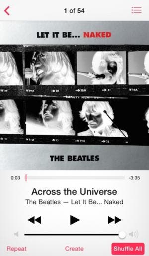
To help solidify this concept, check out the built-in iPhone Music app shown in Figure 1.
The Music app
Figure 1 - The built-in iPhone Music App
  • The labels near the bottom of the screen displaying the artist, song, and album (including font, size, and color), the album art, the previous, next, and play buttons as well as the volume slider control are all part of the user interface;
  • The part of the app that plays and pauses the current song, changes the volume in response to the slider, and moves to the previous or next song is the core logic;
  • The actual music files, albums that group together a list of songs, and playlists comprise the app's data.

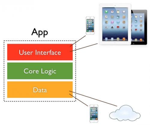
Figure 2 provides a conceptual view of the three parts of an app.
The three parts of an app
Figure 2 - The three parts of an app

As depicted in Figure 2, your app needs to adapt to different user-interface sizes as well as orientations (when the user holds the iOS device upright or sideways). You definitely don't want to hard-code your app to work with a device of a specific size. As Apple continues to release devices with new sizes (such as the 4-inch screen on the iPhone 5), you don't want to have to make major changes to your app to adapt to these new sizes.

Figure 2 also indicates how your app's data may change. You may need to save data on the local device, in the cloud, or often, in both places. Your app needs to easily adapt between different data storage locations and mechanisms.

Your app's core logic is usually the one place where your app remains constant from change. For example, the code that plays a song on your iOS device remains the same regardless of whether the Music app is running on an iPhone, iPod touch, iPad, or iPad mini.

In a future post, I'll include a more in-depth discussion of app architecture. For now, just know that you should do your best to keep the three parts of your app independent from each other so that your app can easily adapt to change. In programming jargon, this concept of separation is known as loose coupling.

What is iOS?

To help round out the picture of app development, it's important to know the answer to the question "What is iOS?" 

Apps are not the only software running on an iPhone, iPod touch, or iPad. These devices also run an operating system called iOS, which manages the device hardware and provides basic services for all apps running on the device.

For example, when you first turn on an iPhone, the Apple icon displayed on a black screen greets you. During this startup phase, the operating system, iOS, gets the iPhone ready for use. It displays the wallpaper and app icons and also tries to find a carrier signal for the cell phone and a wireless signal for Wi-Fi access. When you tap an icon on your home screen, iOS responds by launching the app for you. iOS does this and many other things.

Every time Apple releases a new version of iOS, it improves the core functionality of all devices running the operating system by adding new features, fixing bugs, and even releasing new built-in apps, such as the Reminders app in iOS 6. As it adds new features to iOS, you can enhance your app by taking advantage of these new features. As you design your apps, you get to decide which features of the operating system you want to incorporate into your app. You can use specific hardware and software features for widely different purposes. For example, you can use the microphone to record voice memos or to act as an input for a musical wind instrument as with the Ocarina app. You can use the camera not only to take pictures, but also to view your surroundings using augmented reality as in popular apps such as Yelp.

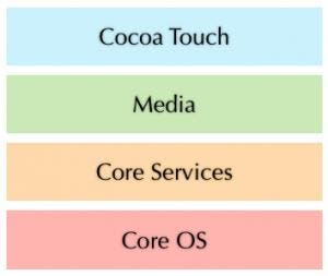
It's important to know that iOS is divided into several layers as shown in Figure 3. Your apps almost always communicate with the Cocoa Touch layer, which provides high-level services that in turn communicate with the underlying hardware for you. This protects your apps from changes in the hardware, allowing them to work well on any iOS device.
iOS Layers
Figure 3 - iOS Layers

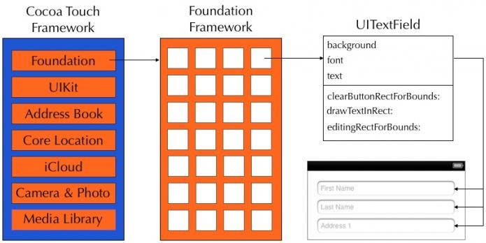
The Cocoa Touch layer is actually a set of frameworks, or reusable sets of tools you can access from within your app. The following table shows a list of some of these important frameworks as well as a description of the functionality they provide for your app.

FrameworkDescription
UIKitContains all the standard iOS user-interface controls you need to design a great user experience, including buttons, text fields, sliders, and table views;
Address BookLets you access the contacts stored on a device from within your app;
Core LocationAllows you to determine the location of the device. You can use this information to display points of interest near the user or even show his or her current altitude;
iCloudLets you store a user's documents and data in a central location on the Internet that can be accessed from any of the user's devices;
Camera & Photo LibraryAllows you to import images from the photo library, take new photos, and create augmented-reality apps using the live camera feed. In iPhone 4 and newer, you can access both front & main cameras;
iPod Media LibraryAllows you to play music in the background while your app runs and provides access to the full media library on the device.

Source Code, Compilers, and Machine Code

When it comes time to create your app's core logic, you need to write some program code. This is the point where a non-programmer learns to become a programmer.

Objective-C is the programming language used to write code for your apps. It is a high-level language, meaning it is closer to human language than the actual code an iOS device executes when it is running your app. A high-level language makes it easier for you as a programmer to understand and write code for your apps. Code written in Objective-C is also known as source code.

Ultimately, an iOS device doesn't understand code written in the Objective-C programming language. Rather, an iOS device understands a machine code instruction set consisting of bits of data (ones and zeroes) specific to its microprocessor. So, there needs to be an interpretation, or conversion, of the Objective-C code that you write into machine code, which an iOS device can understand and execute. The tool that performs this conversion is known as a compiler. When you add Objective-C code to an Xcode project, you build the project in order to run it in the Simulator or on a device. During this build process, the compiler takes the Objective-C code you have written and converts it into machine code as shown in Figure 4.

The compiler converts Objective-C source code to machine code
Figure 4 - The compiler converts Objective-C source code to machine code.

Understanding Classes and Objects

The Objective-C programming language is object-oriented. This means when you write code, you are mostly interacting with objects. When creating an iOS app, the majority of objects that you work with are user-interface objects. For example, Figure 5 shows the Write Review scene you created for the iAppsReview prototype app. It contains a table view, five-star rating control, text field, text view, image view, and buttons. Each of these user-interface controls is an object.
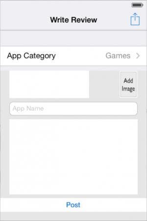
Write Review scene
Figure 5 - There are a variety of user-interface objects in the Write Review scene.

As you have already seen, when you install Xcode on your Mac, a library full of user-interface controls is also installed as seen in Xcode's Object Library in the bottom-right corner of Figure 6.

Creating an object
Figure 6 - Creating a text-field object from the UITextField class

Each of the user-interface controls listed in the Object Library represents an Objective-C class. A class is like a blueprint for an object. You create objects from a class.

For example, when you drag a Text Field from the Object Library and drop it on the design surface (Figure 6), you are creating a text-field object from the Text Fieldclass. You can create many objects from a single class. As shown in Figure 7, three text fields have been created by dragging the Text Field class and dropping it on the design surface. Ultimately, Object Library is a misnomer. It doesn't contain a list of objects, it contains a list of classes. It should really be called the Class Library. I've taught many beginner iOS classes, and I can tell you this has been a common cause of confusion!

Creating multiple text field objects
Figure 7 - Creating multiple objects from a single class

The concept of creating an object from a class is similar to creating a word processing document from a template. You can create many documents from a single template, and the template defines the basic characteristics and behavior of the document.

To find out more information about a user-interface class, you can click the class in the Object Library as shown in Figure 8. This displays a help popup that tells you the formal name of the class (UITextField in this example), as well as a description of the physical attributes and behavior of objects created from that class. 

UITextField class description
Figure 8 - Click a user-interface item to see its formal class name.

Understanding Object Attributes

As you have seen previously in this blog series, you can examine the attributes of a user-interface object using Xcode's Attributes Inspector as shown in Figure 9.

Attributes Inspector
Figure 9 - Viewing an object's attributes in the Attributes Inspector

An object's attributes are defined in the class blueprint from which the object was created. Each attribute has a default value also specified in the class. After an object has been created, you can change the value of its attributes. It's important to note that each object has its own set of attributes, so you can change an attribute on one object without affecting any other objects. 

So, what does this have to do with Objective-C? Apple used Objective-C to create the user-interface classes you use in your iOS projects. In addition, you will be creating some of your own classes in a future blog post, and these will also be written in Objective-C.

Understanding Class Properties

For every object attribute you see in the Attributes Inspector, there is a corresponding property in the class definition. In fact, Apple could have called the Attributes Inspector the Property Inspector (and other development tools do just that).

If you looked at Apple's documentation for the UITextField class, you would see a list of properties such as:

  • background
  • font
  • placeholder
  • text
  • textAlignment
  • textColor

In this context, attributes and properties are similar. In Xcode, a user-interface object you drop on a scene has attributes. In Objective-C, the class on which the object is based has properties. This will all become clearer as we create our own custom classes in a future post.

Understanding Class Methods

Not only do user-interface objects have attributes, they also have behavior. For example, when you touch a text field in an app, a keyboard pops up. Each letter you type on the keyboard automatically appears in the text field.

The behavior of an object, or the actions that it can perform are defined in the class blueprint as methods. A method is comprised of one or more lines of code that are grouped together to perform a specific task.

Figure 10 shows a visual representation of the UITextField class known as a class diagram. It lists a subset of the UITextField class properties and a few of its commonly used methods.

The UITextView Class Diagram
Figure 10 - The UITextField class diagram

Each of these methods can be performed individually and has a different effect on the text field. For example, the drawTextInRect: method displays the text inside the text field.

All objects created from a single class have the same behavior because the same method code runs for every object created from that class. 

Non-Visual Objects

Not all objects can be seen or interacted with as you can with user-interface objects. A great example of this is the view controller object shown in Figure 11.

The view controller
Figure 11 - The View Controller is a non-visual object.

On the right side of Figure 11 is a view. As you have already learned, a view contains one screen of information on an iOS device. Every view in an iOS app has a view controller that works behind the scenes in cooperation with the view. It has properties that:

  • Specify if the user can edit items in the view.
  • Report the orientation of the user interface.
  • Allow you to access user-interface objects.

It has methods that:

  • Allow you to navigate to other views.
  • Specify the interface orientation that the view supports.
  • Indicate when the associated view is loaded and unloaded from the screen.

Another category of non-visual objects that work behind the scenes to accomplish important tasks is business objects. Business objects contain the core logic of your app. They often represent real-world entities such as a customer, product, payment, game, player, and so on. Figure 12 shows a Calculator class that contains properties and methods. A Calculator object can be created from this class and used within an iOS Calculator app to perform basic math functions. 

The Calculator object
Figure 12 - The Calculator object

You will learn much more about creating and using custom classes as we proceed through this blog series.

Conclusion

There are some very important and sometimes difficult-to-understand concepts in this post. If you find yourself scratching your head, I recommend rereading it until terms such as property, method, class, and object become more familiar to you. As you use this information in future posts, it will definitely solidify your understanding of these important concepts on your road to becoming an app developer!

<<Previous          Next>>


Tip of the Day: Take Easy Silhouette Shots with Your iPhone Camera

$
0
0

One of my favorite things about my iPhone is the way even a decidedly untalented photographer like me can easily take and share decent photos and videos using the built-in Camera, and I'm always on the lookout for iphoneography tips to help me improve my skills. Here's one on how to take easy silhouette shots with your iPhone, generously shared with me by iPhone Life magazine's newest editor RheanneSchlee. This really easy trick can result in amazing photos:

Silhouette shots work best when the light is directly behind the subject. (Sunset or sunrise are both good times to capture silhouettes.) And the HDR setting on your iPhone camera should be turned off.

Set up your shot and then tap on the background so your camera will focus on the light in the background instead of the subject. This will cause the subject of the photo to darken into a silhouette.

All the photos in this tip were taken by Rheanne with an iPhone 5s.

Five Apps to Help Bored Travelers

$
0
0

My family will soon be headed for vacation. We are flying to our destination with several connecting flights, so there will be plenty of sitting around in airports and on the planes.

I'm happy to be going on vacation, but I have to admit I absolutely hate to travel. I am not crazy about flying (which is unfortunate because I'm married to an airline pilot).

I get bored sitting for long periods of time and I'm not much of a people watcher.

My kids are now teenagers, so it's not necessary for me to entertain them anymore.

So what's a traveler, who dislikes traveling, to do?

I plan on wasting some time on Facebook and Twitter, but here are some other favorite apps I will be using:

1. Zinio (free) - I love this app! For $5 a month I get what's called a Z-pass. Basically it's digital subscriptions to three magazines. I can swap up to three titles every month and add extra magazines for $1.50 more. I can also download back issues of magazines for an extra cost (I'll be stocking up on Bicycling magazines before we go.) Make sure you include iPhone Life as one of your magazines.


2. USA Today (free) - You don't need a subscription to read articles and view videos on this app. Just like the paper version, you can access different sections such as Life, Travel, or Tech. It doesn't have every article that's available in the actual paper, but there's enough to keep you busy for awhile. It also has a crossword puzzle each day to test your knowledge. The digital version even lets you know when you have a word wrong.

3. Flow Free (free) - This app drives me absolutely crazy, and it's one of my favorites. You connect matching colors with pipe to create a "flow." Pair all colors and cover the entire board to solve each puzzle.


4. iHeart Radio (free) - The downside to this app is that you need an Internet connection; but for sitting around in airports with free Wi-Fi, it's perfect. I can choose stations to listen to from all over the country from Huntsville to Honolulu. One reason I like this app is because it gives me the ability to listen to one of my favorite personalities, Elvis Duran and his morning show. It's always good for a laugh. 


5. Photo Editor by Aviary (free) - On the return trip home, I plan to edit many of the photos I took. Crop a section here, add some color there; it's easy to use. With Aviary, I have many editing choices. There are filters, stickers, and frames, and touch-up features for red-eye and blemish removal. The New York Times even chose Aviary as one of the best apps for iOS 7. 


Sky Force is Back!

$
0
0

Some retro (that funny word) games are just too awesome to stop getting updates and everyone knows that Sky Force is one of them! And now the inimitable top-down blasting game that seemed to go on for infinity is back in 2014, and looking just plain gorgeous (don't know how it plays yet, but some app reviews look positive)! 

It's also free with the IAPs. Developed by the original devs who coded the Sky Force PDA-developed version (waaay back in the 2000s) at Infinite Dreams, it's free at the link above!

Mind-Mapping Roundup: 3 Apps to Map Your Thoughts

$
0
0

I naturally mind map as a way to organize my thoughts; but over the years, I've become accustomed to just taking notes on my computer, which goes with me to every client meeting and planning session. I've recently been in pursuit of the perfect mind-mapping software. My search has been frustrated by unintuitive and unwieldy designs, or simple systems that just don't allow me to do all I would hope to do with the software.

As the owner of a busy PR agency, it's often very late at night or quite a few days after a meeting before I have a chance to sit down with my thoughts and get them organized. So I wondered if mobile mind mapping apps might be the better solution. In fact, it struck me that I should just mind map as I took my noteson the fly, in a system I could show my clients while we brainstorm, and easily send to them when we finish.

With these thoughts in mind, I tested the demos of three popular mind-mapping apps for the iPhone and iPad. I tested these on the fly in meetings, using only my iPhone and my Bluetooth keyboard. Here were my results:

1. Simple Mind+ (Free demo, full version IAP $4.99)

iPhone Life rating: 4.5 out of 5 stars

The first app I tried was Simple Mind+. While the full version offers quite a lot of additional style options, as well as a desktop in the cloud, the demo version is packed with easy-to-use and intuitive features. 

You open directly into a blank mapping screen, which automatically boosts this app in my opinion. With no instructions, you can easily jump in and interpret the icons, from adding notes to adding new nodes. Maps can be organized by color, so that each layer is a separate color, or all of the layers in a single node can be one color. Adding nodes is as simple as touching the "+" button next to the central theme, while deleting them is a matter of touching the node and then touching the trash can. Lines can also be easily modified—to remove a line and allow nodes to stand freely, just tap and trash. Likewise, changing nodes to new locations was a simple matter of dragging and dropping.

The feature that made this, even in demo form, a great product for my needs is the ability to easily email a PDF version directly from my phone. 


2. Mindmeister Collaborative MindMapping (Free demo, subscriptions run from $5.99 per month to $59.99 per year)

iPhone Life rating: 1.5 out 5 Stars

Initially I was hesitant to try this app, as it required a sign-up (I didn't have time to do that in a meeting, so I put it off until another day.) Sitting watching TV one evening, I set it up and spent some time with the tutorial. I'm glad I did. While this app has some amazing features and customization, many of them—such as adding images and live links—come only with the full version. Still, it appeared that the demo had lots of options, from iconography to colorful linking arrows and more. All that was left was to test it in a meeting.

The first thing I noticed was that hitting "Enter" on the keyboard immediately opened a new node from the central theme. That could have been a great time saver, but unfortunately it didn't work the same way at every level—in fact, hitting Enter again, or even touching the "+" button to open a new node opened a new node from the central theme right on top of the first one. After much fiddling, I managed to separate two of them, but couldn't replicate what I did. Additionally, holding and dragging one node moved the entire map. For something to use on the fly in a meeting, it actually limited my productivity and I moved on.


3.  Total Recall (Free demo, unlock unlimited maps for $1.99)

iPhone Life rating: 4 out of 5 stars

Although not quite as intuitively simple as Simple Mind+, the tutorial in Total Recall soon won me over.

Touch the "+" and add a node anywhere on the screen. Touch + again, and draw a line from one node to another. Touch the icon that looks like a paint splatter and you get the color chooser option—which not only has a range of standard colors, but will let you use a color picker as well. You can change lines to arrows, change font sizes, and even change the shape of the node. If you make a mistake, just hit the undo button. It lets you step back as far as five steps from your last entry, which can help with batch revisions or major problems. Moving a node is as easy as holding and dragging, and once you figure out all the ins and outs, there's a lot to love here. It appears the only limit to this demo is the number of maps you can create: three. For unlimited maps, you must purchase the full version.

Total Recall has one final feature I like tremendously. If you touch the email icon, you have options to save your map to your photo album, send it as an image or PDF via email, or even send it as text. 


Final Verdict

While there are dozens of mind mapping apps out there, if you need something that works quickly and in pressure situations, you are likely to find an easy solution in Simple Mind+ or Total Recall. I plan to keep both on my phone for different situations, and, as always, will keep my eyes open for the next best thing!

Recognized Gives Rewards for Users Who Share Employee Reviews

$
0
0

Your waitress retained her radiant smile the whole 30 minutes you spent making up your mind, never showing any hints of impatience after you changed your order for the umpteenth time and was absolutely helpful with your two-year old in the high chair.

For those times when you feel a tip is not enough, don't you wish you had a way to give employees who go the extra mile the commendation they deserve?

Or have you ever received such bad customer service that you simply had to let that person's manager know so other customers did not have to go through the same horrible experience?

An iPhone app called Recognized gives consumers a channel for giving feedback to business owners about their customer service experience. Unlike rants posted through social media sites, customers' feedback will not fall on deaf ears and can be truly used to improve employee performance and the business.

What's great with Recognized is that, in addition to providing consumers an avenue to vent or to commend, the app that gives them discounts and other savings.

Upon launching Recognized from your iPhone, it will load businesses within your area and you can then select the one you for which you would like to leave feedback. After that it will show you a list of their employees and you can proceed in rating him or her on three factors: attitude, speed, and knowledge.


If the employee is not listed, you can add the individual by providing their first name (required), last name (optional), and position (optional).

With these few easy steps, your rating will be routed to the business owners so they can use your feedback to improve their business by using this data for coaching employees, or motivating their staff by letting them know they are doing a superb job. It nips bad behavior in the bud, but reinforces and maintains positive and excellent performance, which can be translated to better consumer experience the moment you come back.


Recognized is an app worth checking out, for customers and business owners alike. All reviews are confidential and there is certainly no catch.

Recognized is free and can be downloaded in the App Store.

Apple News: Cleaning up App Store Reviews

$
0
0

Yogi Berra said "Nobody goes there anymore. It's too crowded." The App Store is great, because there are so many apps, but that's also what makes it a problem. It's hard to find good apps, and even harder for good app developers to stand out.

Some developers have turned to the Dark Side and paid for installs and reviews. This gives them a temporary boost in the rankings, and makes it look like the app is popular for a reason. Usually the fake reviews can be weeded out, but only if the consumer bothers to do some research... most don't, especially at $0.99 per app.

As a developer, I've been a victim of fake reviews. A competitor wrote bad reviews of my app and positive reviews of his. It was pretty blatant, but Apple didn't do much about it. I reached out directly and convinced him to change his ways, and he removed the bad reviews. But that's small potatoes. Now there are entire businesses whose sole purpose is to "sell" positive reviews in the thousands and even tens of thousands.

Apple has had enough, and, as TechCrunch reports, has started to remove those reviews on a grand scale. They still haven't removed the developers' accounts, but it's safe to say they are on probation. The App Store can be a nice source of revenue. Apple has made it easy for software developers to sell apps without the headaches of distribution. If we can't police ourselves, it's time for Apple to do so, to keep the integrity of the ecosystem. After all, it could be worse. Google Play is pretty much a free-for-all!

Counterfeit Versions of the iPhone 6 Debut Overseas

$
0
0

Counterfeit versions of the iPhone 6 are apparently already available overseas. Three months before Apple debuts the latest version of the iPhone, resellers on China's biggest e-commerce site, Taobao.com, are marketing what can be loosely translated as "models" of the iPhone 6. The "models" are believed to be made of old iPhone 5 and new iPhone 6 components.

This is not without precedent. Back in 2012, low-cost knock-offs of the iPhone 5 made it to market before the real product did as well.

Chinese manufacturing practices—and lax legal protection for intellectual property there—have generated this counterfeiting phenomenon. Commercial knockoffs, called shanzai in Mandarin, are a lucrative business in mainland China and the Chinese diaspora. Manufacturers have been known to make fully functioning copies of new products even before they’re released. The designs of the knockoffs are based on news leaks about purported features of the upcoming product.

This isn't just a problem for Apple though; counterfeit goods from Chinafrom drugs to consumer electronics"account for 2 percent of world trade." according to a report by the World Customs Organization and the United Nations.


Photos of iPhone 6 Mockups Posted; NY Times Says iWatch Slated for 4th Quarter

$
0
0

Case manufacturers use mockups in order to make cases and have them ready when new iPhones become available. Those mockups are dummy iPhones based on the specs of the actual device. Which means they can give a sense for what the new iPhones will look like. According to AppleInsider, over the weekend, Sonny Dickson, who has in the past been the first to post leaked photos of new iOS devices, posted to Twitter photos of mockups for the expected 4.7-inch and 5.5-inch iPhones. This is yet one more bit of evidence that larger phones are coming, with the 4.7-inch iPhone 6 expected to be announced in September. The mockups show styling continuity with the iPad Air and iPad mini, with the same sort of rounded edges. The similar shape of the two mockups suggests that the new larger phones will share the same aspect ratio—which would be expected from Apple, as they typically try to make it easy for developers to port their apps to differently sized models. 

Of course, the design could change before the next iPhone is released, so it's prudent not to put too much stock in the details. But it does seem virtually certain that we'll be getting two larger iPhones this fall.

And it seems increasingly likely that we'll be getting an iWatch or other wearable in October. On Sunday the New York Times ran an article about Apple under Tim Cook and discussed whether he's as closely involved in development of new devices as the late Steve Jobs. The article cited lower-level employees who said that Cook isn't as involved in the smart watch as Steve Jobs likely would have been, instead delegating oversight to famed Jony Ive and other executives. The unnamed employees who spoke to the NY Times said Apple's smart watch is expected in the fourth quarter of this year. Interestingly, the article says that rather than being focused on the details of the smart watch hardware, Cook is more focused on its broader implications for health and fitness monitoring. I think that's smart, and that the success of Apple's smart watch will hinge on the larger ecosystem it integrates into.

The original iPhone was closed to developers. The gadget itself was the focus. But Apple eventually opened it up to developers, and the ecosystem and integration with the cloud has become an important feature of the device. So Apple has done well to create the ecosystem first, with HealthKit, and then will launch the device once this fledgling ecosystem is starting to grow.

Analysts Predict iWatch to Outsell iPad in First Year

$
0
0

Todd Hamilton's iWatch concept running a fitness app

Stock analysts that cover Apple predict that the rumored iWatchwhich is expected to be announced in Octoberwill be a runaway hit and even sell more units in its first year of production than the iPad sold in its first year. That would make it Apple’s most successful product ever.

Morgan Stanley analyst Katy Huberty expects the iWatch to post big numbers for Apple. In a note to investors earlier this year, she said she believes the iWatch can bring in as much as $17.5 billion in its first year of availability. In contrast, the iPadApple’s most successful product to datebrought in $12 billion during its first year of sales.

Huberty says her outlook for the iWatch was based on Apple’s expected capital expenditures of $10.45 billion for fiscal year 2014. This is 32 percent more than the company spent in 2013.

"We believe this is an indication that Apple is investing in new product categories as single-digit iPhone and iPad growth no longer demands significant increases in capital expenditures," Huberty wrote in a note to investors.

In terms of units sold, UBS analyst Steven Milunovich is estimating Apple will sell 21 million iWatch units in fiscal 2015. The company sold 19.5 million iPad's during the tablet’s first year. While he thinks the iWatch will outsell the iPad in terms of units sold, Milunovich predicts the iWatch will underperform the iPad in terms of revenue generated. With an average selling price of $300, he notes, 21 million units would only give Apple revenue by $6.5 billion. 

"We expect iWatch sales to roughly track iPad unit salessimilar penetration rates would mean higher sales,” the analyst says. “iWatch might do better because the customer base is larger than when iPad launched and the ASP [average selling price] might be less. On the other hand, iWatch is the first product to be worn, which might not appeal to all users."

Probably the most bullish on the success of the iWatch is Apple itself. The company is reportedly planning to produce three to five million units per month, or 36 to 60 million units a year.

“That's a massive number,” notes The Motley Fool. “Consider that Apple only sold 19.5 million iPads in its first year of availability. Further, thirty six million Apple wearable devices would be more than half of the current annualized iPad sales. In the past twelve months, Apple only sold 71.8 million iPads.”

Over at BMO Capital Markets, analyst Keith Backman thinks Apple could sell 33.5 million iWatch units in calendar 2014 if only 10 percent of the expected 335 million iPhone users buy the wearable device. And that’s his low-end projection.

Bachman assumes the iWatch will sell for $250 per unit. If 10 percent of iPhone users buy one, that would add 3.1 percent to Apple’s earnings per share in 2015.

"We think a key driver of adoption will be meaningful applications," Bachman wrote in a note to investors. "We believe that the initial focus will be health and fitness applications, but to reach 20 percent adoption levels, Apple will need to have more applications than just health and fitness, to include applications for professional/work usage."

The photo accompanying this post shows an iWatch concept with a fitness app, by designer Todd Hamilton.

Tip of the Day: How to Create Custom Reminders in iOS Reminders

$
0
0

When you set up reminders in the iOS Reminders app, you have six options for repeating:

  • Never (default)

  • Every Day

  • Every Week

  • Every two Weeks

  • Every Month

  • Every Year

But what if you need to repeat a reminder at a different interval? Maybe you want to be reminded every three weeks or every six months or weekdays only.

Siri to the Rescue   

If you tell Siri "Remind me to take my bike to the bike shop for a tune up every six months starting May 1st at 10 a.m.," Siri will reply with the reminder: "Take my bike to the bike shop" starting May 1st at 10 a.m. as a custom repeat.

When you open the alert inside Reminders, and click on the (i), you will see Custom Repeat, Every six Months.

If you say "Remind every three weeks to follow up with Jane Doe starting tomorrow at 9:45 a.m.," Siri will echo back "Follow up with Jane Doe, Tomorrow, 9:45 a.m."

The only downside to the iOS Reminders app is that the soonest a reminder can be repeated is one day. So, if you need a reminder to take your medicine every 4, 6, or 12 hours, the iOS app can't help you. I don't understand why this limitation exists, but it does. 

Unleash Your Inner App Developer Part 8: Code Writing First Steps

$
0
0

First Steps

Do you have an idea for an app but lack the programming knowledge to begin building it? In this weekly blog series, How To Unleash Your Inner App Developer, I will take you, the non-programmer, step by step through the process of creating apps for the iPhone, iPod Touch, and iPad. Join me each week on this adventure, and you will experience how fun turning your ideas into reality can be! This is Part 8 of the series. If you're just getting started now, check out the beginning of the series here (this post has been updated to iOS 7.1.)

In my previous post, I mentioned Objective-C, the language of iOS Apps, is an object-oriented programming language. This means when you write code, you are mostly interacting with objects—both visual and non-visual. Working with an object-oriented language is a great advantage for non-programmers who want to learn programming. In this post I'll talk about these advantages, and we'll even get you to write your first lines of code!

A Voyage of Discovery

One of the biggest advantages of object-oriented programming is discoverability—a measure of how easy it is to discover, or find the code you need to perform a particular task.

As mentioned in my previous post, Apple provides dozens of Cocoa Touch frameworks that provide a wide variety of services, which you can access from within your app. Within these frameworks are thousands of classes that provide the specific services you need. It's unreasonable to think you will study all of these classes before writing your first line of code. What you should do instead is learn about different classes as you have a need for them within your app.

So, when you need to perform a particular task, you need to discover which Cocoa Touch class will help you get the job done. For example, let's say you are creating an app that has one text field for the user's first name and a second text field for the user's last name as shown in Figure 1. When the user taps the Done button, you want to display a welcome message that combines the first and last names together (for example, "Welcome Steve Jobs." How do you do this?

First and Last name text fields
Figure 1 - First and last name text fields

It takes just a little bit of research to find out that the Cocoa Touch Framework has a class named NSString that allows you to perform a wide variety of tasks on a set of characters (known in programming jargon as a string). This class has two methods that allow you to combine two strings:

  • stringByAppendingFormat:
  • stringByAppendingString:

Once you learn about the existence of the NSString class, a whole world of string manipulation is opened up to you. NSString contains over 140 methods you can use to manipulate strings! The following table lists a few of the tasks you can perform using the NSString class. The column on the left lists the tasks you can perform and the column on the right lists the NSString methods you can use to perform each task.

TaskMethods
Combine strings

stringByAppendingFormat:
stringByAppendingString:

Dividing strings

substringFromIndex:
substringToIndex:

Finding characters
and substrings

rangeOfString:
enumerateLinesUsingBlock:

Identifying and
comparing strings

isEqualToString:
hasPrefix:
hasSuffix:

Changing case

lowercaseString:
uppercaseString

You don't need to know how all of these methods work right now. I just wanted to give you a sense of the kind of services available in the NSString class.

Object orientation is "the gift that keeps on giving." As you discover new classes, each one opens a world of functionality to you.

Understanding Inheritance

One of the foundational pillars of object-oriented programming is inheritance. The term refers to the concept that a class can be based on, or inherit attributes (properties) and behavior (methods) from another class.

For example, in the class diagram shown in Figure 2, the arrow pointing from the UITextField class up to the UIControl class indicates the UITextField class inherits from the UIControl class.

Figure 2 - UITextField inherits from UIControl.

Because of this relationship, the UITextField class inherits the UIControl class's enabled, highlighted, and selected properties as well as all of its methods. In this relationship, UIControl is known as the superclass of UITextField, and UITextField is known as the subclass of UIControl.

Class inheritance can go much further than just one level. For example, Figure 3 shows the UITextField's heritage traced all the way to the top level. UITextField inherits from UIControl, which inherits from UIView, and so on, all the way up to NSObject, which sits at the top of the inheritance chain. As you walk the inheritance chain the other way, from top to bottom, each class adds new properties and methods, which are inherited by the class below it.

UITextField full inheritance chain
Figure 3 - UITextField's full inheritance chain

In Objective-C, a class can only have one superclass, but it can have zero, one, or more subclasses. For example, UIControl has several subclasses, three of which are shown in Figure 4. This makes sense because UITextField, UIButton, and UISlider are all user-interface controls. Objective-C inheritance allows Apple to create the UIControl class, and put attributes and behavior into it that are common to all user-interface controls. New subclasses can be created that inherit these attributes and behavior from UIControl, and then new attributes and behavior can be added to the subclass that specialize the class to be a text field, button, slider, and so on. 

Classes can have zero-to-many subclasses
Figure 4 - Classes can have zero-to-many subclasses.

Inheritance and View Controllers

One of the places you will most often come across inheritance is with your project's view controllers. When you create a new iOS project, Xcode automatically adds view-controller subclasses to your project. For example, if you create a Master-Detail app Xcode adds MasterViewController and DetailViewController classes to your project as shown in Figure 5.

MasterViewController and DetailViewController classes
Figure 5 - MasterViewController and DetailViewController classes

As you can see in Figure 6, MasterViewController is a subclass of UITableViewController, which is in turn a subclass of UIViewController. The DetailViewController class is a direct subclass of UIViewController. This tells you that the MasterViewController class has been specialized to work with iOS table-view controls and the DetailViewController class has not.

View controller class hierarchy
Figure 6 - View-controller class hierarchy

As you build iOS apps, you will spend a lot of time modifying view-controller classes so it's important for you to understand how the properties and methods of the view-controller superclasses work. As you work with view controllers and other classes in practical situations, the concept of class inheritance will make even more sense.

Introducing the Queen Mother—NSObject

NSObject can be called the "Queen Mother" of all classes in the Cocoa Touch Framework because it defines the basic attributes and behavior for Objective-C objects. For the most part, all classes in the Cocoa Touch Framework, as well as the custom classes that you create, can trace their heritages back to the NSObject class. I say "for the most part," because you can define your own root class that isn't a subclass of NSObject—but you normally should not.

id—the Object Identifier

Since you can declare your own root classes, there has to be another way to refer to any type of object. That's where the id keyword comes in. In Objective-C, all objects are of type id. The id designation provides no information about an object except that it is an object. You will see the id keyword used most frequently when you begin creating code that responds to the user touching the user interface.

Configuring the Feedback Scene

I find there's nothing quite like performing a task yourself to help firm up a new concept, so let's do that now. To follow the steps outlined in this section, you need to download a new version of the iAppsReview project by clicking this link

  1. Open the new version of the iAppsReview project in Xcode;
  1. In the Project Navigator on the left side of the Xcode window, select the MainStoryboard.storyboard file. This displays the storyboard in the center of the Xcode window;
  1. Scroll to the bottom-right corner of the storyboard and you will see the scenes shown in Figure 7

The iAppsReview storyboard

Figure 7 - The update iAppsReview project contains a new Feedback scene.

Notice the new Feedback scene in the bottom-right corner of Figure 7. This new scene allows the user to enter their feedback about the iAppsReview app and click the Send Feedback button to post the feedback online. I find it's critical to have a place where users can provide feedback within your app. If you don't provide a place for them to give feedback here, they will post all complaints in the iTunes reviews section for your app, and give your app a low rating while they're at it! 

As it stands right now, there is no connection between the Settings scene and the Feedback scene. I left the segue out intentionally so you can experience how to create a modal segue. However, before doing this, I'd like you to notice there is a navigation bar at the top of the Feedback scene. Until now, all the scenes you have worked with haven't had a navigation bar until you created a segue to that scene, and then one was added automatically. However, when you create a modal segue, a navigation bar is not automatically added for you. You have to manually drag a Navigation Bar from the Object Library and place it at the top of the scene. You also need to manually add any buttons you want to the navigation bar. In this case, I dragged a Bar Button Item from the Object Library and placed it on the left side of the navigation bar;

  1. Now you're ready to create the segue. To do this, go to the Settings scene, hold the Control key down, click on the Provide Feedback button and drag over to the Feedback scene. When the Feedback scene is highlighted in blue, let go of the mouse button to display the segue popup. Select the modal option from the popup as shown in Figure 8. This creates a new segue between the two scenes;
Select modal from the segue popup
Figure 8 - Select modal from the segue popup.
  1. Now let's configure the segue. To do this, first select the new segue in the design surface, which displays a blue highlight on the Provide Feedback button (Figure 9) because it is the user-interface control that triggers the segue. Next, go to the Attributes Inspector and change the Transition to Cover Vertical as shown in Figure 9. This option causes the Feedback view to rise up from the bottom of the screen when the user taps the Send Feedback button at run time;
Change the modal segue's Transition attribute to Cover Vertical
Figure 9 - Change the segue's Transition attribute to Cover Vertical.
  1. OK, let's give it a try. Press Xcode's Run button, and when the app appears in the Simulator, select Settings & Feedback, and then click the Provide Feedback button. You will see the Feedback view pop up from the bottom of the screen;
  1. Now click the Cancel button. You may have expected the Feedback view to slide down and disappear into the bottom of the screen, but notice nothing happens when you click the button. We don't get this default behavior because we had to manually create the navigation bar and Cancel button. In order to close the Feedback view, we need to write some code, which we will do in just a bit;
  1. Go back to Xcode and click the Stop button to stop the app from running in the Simulator.

Three Steps to Custom Code

Whenever you need to perform a custom action associated with a particular scene (such as dismiss the Feedback view), you need to write some code. Where do you put this code? In a custom view controller you create specifically for that scene. There are three key steps involved in this process:

  1. Add a new view-controller class to the project;
  1. Associate the new view-controller class with the storyboard scene;
  1. Add custom code to the new view-controller class;

We will perform each of these steps in the next sections.

Adding a New View-Controller Class to the Project

Follow the steps below to add a new view-controller class to the iAppsReview project. 

  1. Select File > New > File... from the Xcode menu. This displays the New File dialog shown in Figure 10;
New File Dialog
Figure 10 - Select Cocoa Touch and Objective-C class in the New File dialog.
  1. On the left side of the dialog, under the iOS section, select Cocoa Touch. In the panel on the right, select Objective-C class and then click Next. This displays the second step of the New File dialog as shown in Figure 11;
Create a new FeedbackViewController class.
Figure 11 - Create a FeedbackViewController class, based on UIViewController.
  1. In the Subclass of box, enter UIViewController. This indicates the new class you are creating is based on, or inherits from the UIViewController class. I like to specify this selection first because it prefills the Class box with the text ViewController;
  1. Next, in the Class text field, add the prefix Feedback in front of the ViewController class to name the class FeedbackViewController. I like to name the view controllers based on the scene with which they will be associated. Since this view controller will be associated with the Feedback scene, FeedbackViewController is a great name;
  1. Click the Next button. This displays the Save File dialog as shown in Figure 12;
Save File dialog
Figure 12 - The Save File dialog
  1. Click the Create button to create the new view-controller class and save it in the project's root folder. After a few seconds, you will see two new files in the Project Navigator as shown in Figure 13.
New view controller files
Figure 13 - The new view-controller files in the Project Navigator

Notice that two FeedbackViewController files have been added to the project—one with a .h extension and one with a .m extension. All classes in Objective-C are comprised of two files. The first file, FeedbackController.h, is a public class header file (also known simply as header file). The header file declares the class's public interface to other classes. It's called a public interface because it describes the properties and methods that can be accessed by other classes. 

FeedbackController.m is a class implementation file (also known simply as implementation file). It implements, or contains the actual code for, the properties and methods declared in the public interface;

  1. Select the FeedbackViewController.h file in the Project Navigator. The code within is shown in Figure 14.
Header file code
Figure 14 - The code contained within the FeedbackViewController.h file

Here are some important points to note:

  • The text in green at the top of the file are comments. In Objective-C, comments are used for documentation purposes. Comments are not code and are therefore not executed by an iOS app;
  • Directly below the comments, at the top of the file, is a #import statement which we will discuss in a future post;
  • The actual class interface definition begins with the @interface directive and ends with the @end directive;
  • The header file declares the class name, in this case, FeedbackViewController;
  • The header file declares the class heritage. In this case, UIViewController is the superclass of FeedbackViewController;
  • In the header file, you declare public properties and methods. "Public" means that someone can create an object from your class, call these methods, and access these properties.
  1. Select the FeedbackViewController.m class implementation file in the Project Navigator to see its contents. The code within is shown in Figure 15 (I've left out the comments at the top of the file this time).
Implementation file code
Figure 15 - The code contained within the FeedbackViewController.m file

Here are some important points to note about this code:

  • The actual class implementation begins with the @implementation directive and ends with the @end directive;
  • The implementation file is used to add the actual code to public methods as well as to declare private methods;
  • There are three methods in this file:
  1. initWithNibName:bundle:
  1. viewDidLoad
  1. didReceiveMemoryWarning
  • It's common for a new code file to have methods like this contained within it when you first create a class. These methods are placed here for your convenience because they are common places where you can add custom code;
  • The left curly brace ( { ) marks the beginning of the method's code. The right curly brace ( } ) marks the end of a method's code. When you add code to a method, you must always make sure the code you add is between these two curly braces!

You will learn much more about method declarations in a future post. I just wanted to hit the highlights for now.

Associating the FeedbackViewController With the Feedback Scene

Now that you have created the new FeedbackViewController class, it's time to associate it with the Feedback scene.

  1. In the Project Navigator, select the MainStoryboard.storyboard file;
  1. Click on the status bar at the top of the Feedback scene. When the blue line appears around the scene (Figure 16), it indicates that you have selected the scene's table view controller;
The view controller's class
Figure 16 - Viewing the Class of a view controller
  1. Go to Xcode's Identity Inspector by clicking the third button from the left in the Inspector toolbar as shown in Figure 16. Notice that, by default, the Class of the view controller is set to UIViewController. This means that at run time, when the Feedback view is loaded, a view controller object is created from the UIViewController class to manage the Feedback view. This works great for a prototype app, but now that we want to write some custom code associated with this scene, we need to change the Class to our custom view controller;
  1. In the Identity Inspector's Class combo box, enter FeedbackViewController. As soon as you start typing the first few letters, Xcode should automatically fill in the class name FeedbackViewController. However, due to a bug in Xcode, this doesn't always happen. If the class name doesn't auto-fill, make sure you enter FeedBackViewController with the exact upper/lower case letters shown here.

Adding an Action Method to the FeedbackViewController Class

Now that you have associated the FeedbackViewController class with the Feedback scene, you're ready to write some custom code. This is where Xcode comes to the rescue. Xcode can actually write some of the code for you, as you will see in this section!

  1. With the Feedback scene's still selected go to the top right of the Xcode window and click the center button in the Editor button set (Figure 17).
Select the Assistant Editor button
Figure 17 - Select the Assistant Editor button.

Doing this displays the FeedbackViewController.m code file in the Assistant Editor as shown in Figure 18. The Assistant Editor's job is to display files associated with the file you currently have open in the standard editor. Because you associated the FeedbackViewController class with the Feedback scene in the previous section of this post, when you click the Assistant Editor button, it automatically opens the FeedbackViewController implementation (.m) file;

The assistant editor
Figure 18 - The FeedbackViewController.h file is displayed in the Assistant Editor.

Note: If the FeedbackViewController.m file does not automatically appear in the Assistant Editor, check the toolbar at the top of the Assistant Editor. If it says Manual as shown in Figure 19, click the section of the toolbar that says Manual, and then select Automatic> FeedbackViewController.m from the popup menu.

Select Automatic
Figure 19 - Select Automatic > FeedbackViewController.h.
  1. Click on the Cancel button in the navigation bar at the top of the Feedback scene to select it;
  1. Next, go to the Connections Inspector by clicking the button on the far right of the Inspector toolbar (Figure 20). The Connections Inspector allows you to connect user-interface controls with method code in a scene's associated view controller;
  1. Now we're going to have Xcode help us create an action method. An action method is a method that is executed at run time in response to a user's action, such as tapping a button. In the Connections Inspector under the Sent Actions section, click on the empty circle to the right of the selector action (known as a connection well) and drag down into the FeedbackViewController.h file just above the @end declaration until you see the Insert Action popup shown in Figure 20. The blue line that appears between the connection well and the code file reinforces the concept that you are creating a connection between the Cancel button and the FeedbackViewController header file;
Create an action method
Figure 20 - Create an action method.
  1. When you see the Insert Action popup, let go of the mouse button to display the Connection popup shown in Figure 21. This popup allows you to specify the name of the action method to be created;
The Connection popup
Figure 21 - The Connection popup
  1. In the Connection popup's Name box, enter cancel as the name of the method to be created (Figure 21) and then click the Connect button. This creates a new method declaration in the FeedbackViewController.h file as shown in Figure 22. Again, we'll cover more in depth information on method declarations later in this series, but for now, you just need to know that Xcode has automatically declared a new method named cancel: in the FeedbackViewController header file. The IBAction keyword indicates that this is an Interface Builder action method;
The new cancel method
Figure 22 - The new cancel: method declaration
  1. Notice the connection well to the left of the new cancel method. The circle has a dark grey center, indicating the method is connected to a user interface control. To see which use interface control a method is connected to, you can simply hover your mouse pointer over the connection well, and the associated user interface control is highlighted in the design surface as shown in Figure 23.
Hover over the connection well
Figure 23 - Hover over an action method's connection well to see the user-interface control it's connected to.

You an also view the connection to the cancel: method in the Connection Inspector. As shown in Figure 24, you can see that the Cancel button (the object that is currently selected in the design surface) is connected to the cancel: method in the Feedback View Controller;

Connection Inspector
Figure 24 - The Connections Inspector shows the Cancel button's connection to the cancel method.
  1. You are finished with the Assistant Editor, so you can hide it by clicking the Standard Editor button on the left side of the Editor button group as shown in Figure 25;
Select the standard editor button
Figure 25 - Select the Standard Editor button.
  1. Now go back to the Project Navigator, select the FeedbackViewController.m file, scroll to the bottom of the code file and you will see that an empty cancel: method has been added as shown in Figure 26
Cancel method implementation
Figure 26 - The cancel: method in the FeedbackViewController.m file

This method implementation was created at the same time as the cancel: method declaration when you clicked Connect in the Connection popup (Figure 21). Although Xcode did all the work for you, this is how you declare a method in Objective-C. You declare the method in one of two places:

  1. In the @interface section of your implementation (.m) file (Figure 22) if you only want the method to to be accessible within the class in which you declare it (this is usually the case for action methods)
  2. In the class header (.h) file if you want it publicly accessible to other classes in your project 

After declaring the method you implement the method in the class implementation (.m) file.

Let's Write Some Code!

As it stands right now, there is no code in the method (between the curly braces), so if you were to run the app in the Simulator, clicking the Cancel button still wouldn't do anything. Fortunately, all you need to do is add one line of code to this method to hide the Feedback view.

  1. To do this, click to the right of the left curly brace on the first line of the method, and then press the return key twice. This creates an empty line where you can begin typing the code. I'm going to take you step-by-step through the mechanics of entering this code and then we'll talk about what the code does;
  1.  Type a left square bracket, and then type the letters se as shown in Figure 27. As soon as you do this, Xcode displays a Code Completion popup that helps you write code. Based on the characters you type, it provides its best guess as to what you need to complete a code statement. As it turns out, Xcode guessed correctly—you were typing the word self. In this context, self refers to the class in which you are typing the code—in this case, the FeedbackViewController class. As you will learn in just a bit, our ultimate goal with this code is to pass a message to the FeedbackViewController, telling it to dismiss itself. A message is an instruction you pass to an object, telling it to execute a particular method. In Objective-C you place code that passes a message within square brackets. That's why you started off typing a left square bracket;
Typing self
Figure 27 - Xcode's Code Completion helps you write code.
  1. Press return to have Xcode automatically enter the full text of the word for you. If the Code Completion popup goes away, then just press the escape key to bring it back. When you press return, Xcode adds the letters lf to complete the word self;
self Code Completion
Figure 28 - Code Completion completes the keyword self.
  1. Next, hit the space bar and then type the letters dis. When you do this, the Code Completion popup appears as shown in Figure 29.
dismiss Code Completion
Figure 29 - Code Completion appears for the "dis" characters you typed.

The last method that is highlighted in the list in Figure 29, dismissViewControllerAnimated:completion, sounds exactly like the method that we want the FeedbackViewController to execute. At the top of the Code Completion popup, there is a short description of the currently selected method, and there is even a More... link you can click to find out more about the method. If this method is not currently selected, you can use your up and down arrow keys to select the method manually;

  1. Press the return key to select the method. When you do this, Code Completion adds the code template shown in Figure 30.
Figure 30 - The dismissViewControllerAnimated:completion: method template

Notice the sections of code highlighted in gray—(BOOL) and ^(void)completion. These are placeholders in which you need to enter Objective-C code. When you pass a message to an object, you often pass additional information known as arguments to further specify the behavior you want from the method being called. These placeholders are where you enter the additional arguments.

Currently, focus is set to the (BOOL) placeholder. When you see this type of placeholder, you can type either YES or NO. In this case, you are specifying whether you want the FeedbackViewController dismissed with an animation (so it slides back down through the bottom of the screen), or whether you want it to simply disappear from view. We want to include the sliding animation, so type the word YES for the argument value as shown in Figure 31;

Type YES
Figure 31 - Type YES in the (BOOL) placeholder.
  1. Next, press the tab key to move to the ^(void)completion placeholder. This placeholder provides an opportunity for you to pass code that you want to be executed after the view controller has been dismissed. In this case, we don't need to do anything afterwards, so just type the keyword nil as shown in Figure 32, which indicates you don't want to do anything afterwards;
Type nil
Figure 32 - Type nil in the ^(void)completion placeholder.
  1. There is only one other thing to do to finish this line of code, and that is add a semicolon to the end of it. As is true with other C-based languages such as Java and C#, each line of code in Objective-C must end with a semicolon. The easiest way to do this is press the right-arrow key (located in the bottom-right corner of your keyboard) which takes you past the closing right-square bracket, and then type a semicolon. Your completed line of code should look like Figure 33.
Add a semicolon
Figure 33 - Add a semicolon at the end of the line.

To review, this code passes a message to the FeedbackViewController (self) telling it to run the dismissViewControllerAnimated:completion: method. A YES argument is passed indicating the view controller should be animated as it is dismissed, and a nil is passed as the completion argument, indicating no further action is necessary after the view controller is dismissed.

Watching the Magic Happen

Now you're ready to see your first line of code in action as outlined in the following steps.

  1. Click Xcode's Run button; 
  1. Click the Settings & Feedback row, and when the Settings view appears, click the Provide Feedback button, which displays the Feedback view;
  1. Click the Cancel button, and the Feedback view should slide down through the bottom of the screen.

Congratulations! You have successfully written and executed your first Objective-C code!

Conclusion

If all of this seems like a lot to take in, I recommend re-reading this post until the concepts of inheritance, messages, arguments, and methods become clearer for you. You can download the completed (so far) version of iAppsReview at this link.

In my next post we will dive even further into these different concepts as we continue to write code that turns our iAppsReview prototype app into a real-world app.

<<Previous          Next>>

WINNERS of the iPhone Life June 16th Biweekly Giveaway

$
0
0

Thanks to everyone who entered theJune 16th iPhone Life Biweekly Giveaway! Every other week we give away three amazing prizes, so if you didn't win this time, make sure you enter the June 30th giveaway and tell your friends to enter too!

And the winners are... (drum roll please):


Chad Leggett, Jared Collier, and Victoria Kosirog. 


If you see your name but didn't receive an email, please check your spam folder.

Didn't Win This Week? No worries! Visit iphonelife.com/giveaways for the chance to win in the next giveaway round.


This weeks featured items are:

1. LifeCharge iPhone 5/5s Battery Case: Retail Price $79.99

LifeCHARGE Battery Case's sleek, streamlined design naturally fits to the form of your phone, allowing portability of your original iPhone 5/5s. Never run out of power again with the built-in 2300mAh lithium-Polymer battery. It offers up to eight hours of added time on a 3G network, 10 hours of Internet use on Wi-Fi, 40 hours of Audio playback time or 10 hours of video playback time. Eye-catching LED indicators inform you what energy level you're currently operating under.


2. Naztech PB10400 Universal Power Bank: Retail Price $79.99

The Naztech PB10400 Universal Power Bank is an unrivaled combination of power and design that allows you to keep all your mobile devices charged while on the go. With five USB ports and multiple included connector tips, the PB10400 is a perfect solution to accommodate all the needs of your mobile devices while on a road trip, hike, or long flight. The unit's tremendous 10400mAh power capacity charges up to 5 devices (or even 2 iPads & similar tablets) simultaneously effortlessly and efficiently with up to 3.1 amps. Never run out of power again!


3. Bandshell iP5 iPhone 5/5s Case: Retail Price $29.99

The Bandshell case is ultra-slim and durable, and improves your iPhone listening and viewing experience. This dual-purpose case amplifies the volume and sound quality of your music, videos, podcasts, movies, and programs without the need for extra speakers or cords. The Bandshell kickstand allows the phone to stand up on its side making it easier to watch movies and videos without having to hold the phone or lean it against something. Enjoy using your smart phone to listen to music, watch videos, host a conference call, or make a live recording. The patented retractable sound door makes it happen. With seven stylish colors, you can personalize your phone while experiencing the Bandshell advantage.


Questions or comments? Email Brian@iphonelife.com. Good luck and remember to visit iphonelife.com/giveaways to enter! Also check out our other contests at iphonelife.com/contests. The next contest drawing is June 30th!

Apple Updates App Store Sales Tracking Tools

$
0
0

Apple has created an entire growth industry, thanks to the App Store. But as a developer, it hasn't always been easy tracking sales, which is important for marketing, planning and pricing. In the past, I've used services such as AppViz from IdeaSwarm, AppFigures, Flurry, Distimo, and App Annie, in addition to Apple's iTunesconnect, of course. Recently, there has been a flurry (pun intended) of activity on this front.

AppViz

AppViz is now available as an iPhone app. IdeaSwarm recently migrated their already very functional Mac app to an elegant interface that is cloud-based. This eliminated one of the main concerns of having to have your Mac download the reports every day (or at least not go two weeks without downloading them, as Apple purges reports after two weeks.) But instead of the flat-rate pricing, they shifted to a per-app price that some app developers, especially those with many free apps, could find disconcerting. However, the app is powerful and pretty and worth it for many users.

Distimo is free, and they support iOS, Mac OS, iAds, Google Play, Amazon, Microsoft Windows, Samsung Bada, and other app stores. Since I have apps on all of those platforms, this was important to me. It's nice to have one dashboard with all of my daily sales, and daily email reports automatically sent as well. The news here is that App Annie, probably Distimo's largest competitor, is acquiring Distimo, to create a Goliath in app sales analysis.

iTunes Connect 3

This may have been prompted by Apple's recent update to their iTunes Connect mobile app. In addition to Apple's iTunesconnect website, developers could use the iOS app to track sales. However, it was pretty bare bones for the longest time. Apple recently gave the app a makeover and it is more robust. I use it, but given that it only tracks Apple sales (naturally) I plan to continue to use the Distimo + App Annie service as my primary dashboard. Developers, what tools do you use and prefer? Let us know in the comments!

Use Your iPhone to Build a Successful Business

$
0
0

In this article you will learn how to connect to your purpose and manage your time, two critical critical components of building a successful business. The apps you need for the exercises in this article arePic-Collage (free) and Producteev (free) (or a similar task management system.) 

Setting up a business can be heaven or hell and the majority of businesses fail within the first few years.

I personally was close to bankruptcy after one year of doing my own thing. My credit card was maxed out and I had to borrow from friends to be able to pay the rent. 

I was very close to giving up. 

Three years later I am super thankful that I kept going, as owning a successful business can be the most rewarding thing there is. Now I love what I do and I make a lot more money then when I was an employee. And thanks to technology, I have a flexible office that can be set up anywhere in the world. 

The principles I now teach in smartphone coaching are the same principles I personally used to achieve this. 

My personal

First principle - Know What You Want and Why You Want It.

Having a clear direction and a clear why is the start of any business. If your why is strong enough, you will jump over any hurdles coming your way. The way I did this with my smartphone was that I spent some time reflecting on my why; why it was an absolute must for me to build a successful business. 

I then cut some pictures together and wrote my why on the picture. I put it on my phone and scheduled in my calendar to look at it every Monday. Thanks to some new apps this was simple to do. I recommend Pic Collage for easily gathering pictures and writing text on top of it. 

Learn to Manage Your Time

When I coach business owners there is one mistake I see over and over again. There is no system in place to manage their time. This means they are overwhelmed with all the things they need to do. It is all in their heads leading to stress and worry. They feel they can never relax, and while they are having dinner with their family all the different business things are spinning in their head. In smartphone coaching we teach people to put all their ideas, to-dos, commitments, etc. in their phone. I personally use the application Producteev. Here I put everything that is in my head organized according to priority. The app is synced with my computer, iPhone, and iPad. Many times ideas come when you can not do anything about them. If you don't capture this it will keep popping up in your head. My mentor in entrepreneurship, Eben Pagan, teaches that we should at any given time either be in a productive mood or a rejuvenating mood. This means that when I am relaxing with my family I am 100 percent present instead of thinking about all the things I need to do the next day when back in the office. 

Summary: 

If you know your ultimate goal and the purpose of your business, hurdles will be easy to overcome. If you also have a proper time management system in place to implement and prioritize your to-dos, building a successful business will be a lot easier. You now know what you want and why you want it, and you have a system in place for taking action.

Use Pic Collage to do a picture with your why and put it into your phone. Look at it often. Implement a system to gather everything in your mind. Producteev works well for me but try a few and find the one you like the most. 

Once you have implemented and had success send me an email or a message on Facebook, as I would love to hear your success story!


Stressed Out? 5 Apps to Help You Relax

$
0
0

In times of stress, you can turn to your iPhone.

Your body’s natural reaction to stress — known as the “fight or flight” response — can negatively affect your health, according to the American Psychological Association, and can make already existing health problems even worse. And while it’s normal to experience some stress throughout the day, even just a little bit can have an effect; for instance, you might get a stomach ache when you’re nervous for an exam at school.

Those who suffer from chronic stress should consult a doctor, and there are apps available like StressCheck (free) and Stress Doctor ($4.99) that even enable you to measure your stress levels. At the same time, the iPhone offers a variety of apps that can help you reduce your stress through relaxation and deep breathing exercises. Here’s a roundup:

1. Cleveland Clinic Stress Meditations (free)

Created by the Cleveland Clinic’s Wellness Institute, this app to provide a variety of different guided relaxation and meditation techniques to help you relax during stressful situations, including the full-body scan, self confidence, guided imagery, a calm mind, loving kindness, letting go, mindfulness, and “miracle around us.”

The Cleveland Clinic aims to help people achieve a healthy lifestyle through fitness, nutrition, and stress management, according to the clinic’s website.

2. Simply Being ($0.99)

This app, developed by Meditation Oasis, talks you step by step through the meditation process — and you can choose the length of time that you want to meditate, whether it’s 5, 10, 15, or 20 minutes, and whether or not you want some soothing music or nature sounds in the background.

3. Breathe2Relax (free)

This app guides you through customized deep-breathing exercises. Set a relaxing image to look at and music that soothes you as a voice takes you step by step through your session. The app also offers information about the health effects that stress has on your body.

4. Universal Breathing: Pranayama (free or $6.99 for the full version)

Pranayama is the practice of controlling your breath, and this app allows you to do just that. The app combines background music with animated visuals to guide users through the deep breathing process and help relieve stress. You can select from different choices of music and times your breaths for you, too.

5. Ambiance ($2.99)

With Ambiance, you can choose from more than 3,000 relaxing sounds to listen to, and you can also mix songs together, create playlists, and more. You can also wake up to sounds of your choice as an alarm and record your own sounds to add to your list.

Tip of the Day: How to Quickly Invert Colors for iPhone Use in Low-Light Situations

$
0
0

A few days ago I was on a late night stroll with my dog, when I received a text from my daughter that needed a reply. During the exchange that followed, I dictated my texts instead of attempting to type out a reply while walking or holding an energetic puppy still; but even so, I had to take a moment after sending each message to stop and let my eyes readjust to the darkness.

I could have gone in to my settings and selected Invert Colors, but I didn't feel like stopping and taking the time. "If only there were a way to quickly invert the colors of my screen," I thought as I squinted into the glare of my iPhone's screen.

It turns out there is a way:

You can create a triple-click shortcut to quickly invert the colors on your iPhone screen by going to Settings>General>Accessibility and tapping Accessibility Shortcut and selecting Invert Colors

Now whenever you need to use your iPhone in the dark and want to give your eyes a break, just triple click the Home button. To return your screen to normal, just triple click again.

Top image credit:  Mikhail Zahranichny/Shutterstock.com

Unleash Your Inner App Developer Part 9: Sending Messages

$
0
0

Do you have an idea for an app but lack the programming knowledge to begin building it? In this weekly blog series, How To Unleash Your Inner App Developer, I will take you, the non-programmer, step by step through the process of creating apps for the iPhone, iPod Touch, and iPad. Join me each week on this adventure, and you will experience how fun turning your ideas into reality can be! This is Part 9 of the series. If you're just getting started now, check out the beginning of the series here (this post has been updated to iOS 7.1.)

In my previous post, I taught you how to write your very first line of code. In the process, I touched on the concept of passing messages in Objective-C. In this post, we're going to take a closer look at the important concept of passing messages, and we will also work on converting the prototype iAppsReview into a fully-functional app.

Reviewing Terminology

When you're a newcomer to programming, the terminology can be a bit overwhelming. To help you out, let's review some of the important terms you learned in the past few posts. As you review each term, use Figure 1 as a visual reference point.

  • Framework - A set of tools you can access from within your app. For iOS app development, Apple provides Cocoa Touch, which is a set of frameworks (some of which are shown on the left side of Figure 1) that each provide functionality and services for your app. The Foundation Framework shown in the center of Figure 1 contains core functionality required by all iOS apps;
  • Class - A class is like a blueprint that defines the attributes and behavior of objects. For example, the UITextField class shown on the right side of Figure 1 is part of the Foundation Framework and is the blueprint for all text-field objects in your app;
  • Property - Defines a characteristic of a class. Classes usually have several properties. For example, the UITextField class has properties such as background, font, and text;
  • Method - Defines the behavior of a class. A method groups one or more lines of code that are executed as a unit. Classes usually have several methods. For example, the UITextField class has methods such as clearButtonRectForbounds:, drawTextInRect:, and editingRectForBounds:;
  • Object - A class that has "come to life." You can create multiple objects from a single class. For example, the bottom-right corner of Figure 1 shows three text-field objects created from the UITextField class.
Frameworks, classes, and objects
Figure 1 - An overview of frameworks, classes, properties, methods, and objects

Now that we have reviewed the basic terminology, let's talk about messages.

Messages 101

To run a specific method on an object, you pass a message to the object requesting it to run that method. For example, in Figure 1, the stringByAppendingString: message is passed to the myString object, and it returns an appended string:

Pass string message
Figure 2 - Passing the stringByAppendingString: message to a string object

The act of sending a message to an object is known as a message call. Figure 3 illustrates the anatomy of a message call.

Anatomy of a message call
Figure 3 - The anatomy of a message call

Here are the key things to note:

  • A message call begins with a left square bracket and ends with a right square bracket;
  • The object you are sending the message to is known as the receiver;
  • The message can be broken down into two parts:
  1. The selector is the name of the method;
  2. An argument is a piece of data sent to the method.

To demonstrate another example of this, Figure 4 shows the anatomy of the message call you created in my previous post.

Anatomy of a message call 2
Figure 4 - The anatomy of the dismissviewControllerAnimated:completion method call

Here are the key things to note:

  • In this example, self (the view controller) is the receiver object;
  • dismissviewControllerAnimated:completion: is the full name of the method (this is discussed in the next section);
  • There are two arguments passed in this message, YES and nil.

The syntax of passing messages in Objective-C is a bit unusual, and even trips up seasoned developers coming from other C-based languages such as Java, C#, and C++.

Method Names in Objective-C

In Objective-C, method names are camel cased, meaning the first letter is always in lower case, and the first letter of each word in a compound word is uppercased (like a camel's head and its humps).

In Figure 4, there are two arguments passed in the message call. Notice there is a completion: description before the second argument. This description helps document what the argument is used for. In this case, the description completion: tells you that the code you pass is executed upon completion of the view controller being dismissed. In Objective-C, a method name includes all keywords including colons and argument descriptions. That's why dismissViewControllerAnimated:completion: is the full name of the method.

Two Kinds of Methods

In Objective-C there are two main types of methods—instance methods and class methods. Instance methods are called on objects—meaning you create an object from a class and then pass a message to the object. In contrast, class methods belong to the class itself, meaning you pass the message to the class directly without creating an object from the class.

All of the methods you have seen so far have been instance methods. Let's use the NSURL class to demonstrate how to call a class method. The NSURL class has a variety of methods for working with URLs (uniform resource locators, or character strings that reference an Internet resource or a local file on an iOS device). Typically, a URL is a web address that points to a resource such as a website, HTML page, or image. In iOS apps, you work with NSURL objects rather than with simple URL strings, so you often need to convert a simple string to an official NSURL object. The NSURL class has a URLWithString: method that allows you to do this. You pass the class method a string, and it returns an NSURL object.

Figure 5 shows the anatomy of a message call to the URLWithString: method of the NSURL class.

Anatomy of a class method call
Figure 5 - Anatomy of a class method call

Here are the key things to note:

  • The receiver is the NSURL class, not an object;
  • URLWithString: is the selector. This method accepts a string argument (Apple's website is passed in this example), which it converts to an NSURL object;
  • The NSURL object that is returned from the URLWithString: method is saved in a variable named myURL.

Figuring Out How to Pass a Message

As you write code for your app, you are going to call many methods on many Cocoa Touch classes and objects. Maybe you need to send a text message, find the user's current location, or get the current user's high score in a game. It's one thing to figure out which class and method to call. It's another hurdle to figure out how to call that method. I'd like to demystify this process for you and break it down into steps.

Steps for Calling an Instance Method

Here are the main steps for calling an instance method on an object:

  1. Create the receiver object (the object you are passing a message to), if the object isn't already created;
  1. If there is a return value:
  • Create a variable to hold the return value (you can name it whatever you want);
  • Type "=" to store the return value into the variable.
  1. Type a left square bracket to start the message;
  1. Type the name of the variable that holds the receiver object;
  1. Type a space and then the name of the method to be called;
  1. If there are any arguments:
  • Type a colon and then the first argument value;
  • Do the same for any additional arguments.
  1. Type a right square bracket to end the message;
  1. Type a semicolon to end the statement.

You can refer back to these steps any time you need to call a method on an object.

Steps for Calling a Class Method

Here are the main steps for calling a method on a class:

  1. If there is a return value:
  • Create a variable to hold the return value (you can name it whatever you want);
  • Type "=" to store the return value into the variable.
  1. Type a left square bracket to start the message;
  1. Type the name of the class you are sending the message to;
  1. Type a space and then the name of the method to be called;
  1. If there are any arguments:
  • Type a colon and then the first argument value;
  • Do the same for any additional arguments.
  1. Type a right square bracket to end the message;
  1. Type a semicolon to end the statement.

These steps are very similar except you don't need to create an object from a class, and you send the message to the class itself, rather than to an object.

Interpreting Apple's Documentation

Apple provides documentation for all of the classes in the Cocoa Touch framework. I'm going to teach you how to interpret this documentation so you can know how to pass messages to objects and classes. 

Figure 6 shows Apple's documentation for the NSString class. Notice that in the Table of Contents, the left side of this image, there is one entry for Class Methods and another entry for Instance Methods. This makes it easy for you to determine the type of a particular method.

Figure 6 - The NSString Class Reference documentation

If you expand the Instance Methods node, you will see dozens of methods. If you click on the stringByAppendingString: method you will see the documentation shown in Figure 7.

 documentation
Figure 7 - stringByAppendingString: documentation

At the top of the image you can see the description that says "Returns a new string made by appending a given string to the receiver." This means that when you pass the stringByAppendingString: message to a string object (the receiver of the message) the string object appends the string you passed in the message to its own internal string value and returns the resulting string to you.

Directly below this description, the documentation describes the stringByAppendingString: method. This is known as the method signature:

- (NSString *)stringByAppendingString:(NSString *)aString

Here are the key things to note:

  • The minus (-) sign is used in Objective-C to indicate that a method is an instance method;
  • The value in parentheses indicates the type of the return value. In this case, it indicates this method returns a value of type NSString;
  • stringByAppendingString: is the name of the method;
  • The method accepts a single parameter whose type is NSString.

You often see the terms argument and parameter used interchangeably. An argument is a piece of data that you pass to a method. A parameter is a part of the method declaration that dictates the argument(s) to be passed to the method. In short, arguments appear in message calls, parameters appear in method declarations.

Now let's take a look at Apple's documentation for a class method. Figure 8 shows the documentation for the URLWithString: class method of the NSURL class.

URLWithString
Figure 8 - URLWithString: documentation

We have already discussed what this method does, but I'd like you to take a look at the method signature. Here are the key things to note:

  • The plus (+) sign is used in Objective-C to indicate that a method is a class method;
  • The value in parentheses indicates the type of the return value. In this case, it indicates this method returns a value of type id. As you have learned, id means "any object." However, if you look further down in the documentation under Return Value, it says the method returns an NSURL object. Any time you know the type of the value returned from a method, you should use it instead of the generic id type;
  • URLWithString: is the name of the method;
  • The method accepts a single parameter whose type is NSString.

As we continue in this blog series, you will see many different method signatures, but the information in this post should help you decipher a wide variety of instance and class methods.

Let's Send Some Messages—Hiding the iOS Keyboard!

Now that I've laid out the basics of Objective-C messaging, let's go back to iAppsReview and add some functionality to the app by sending messages.

Note: To follow the instructions in this post, you must first download the latest version of iAppsReview from this link. If you run into trouble while following the steps in this post, you can get the completed (so far) version of iAppsReview from this link.

Our first job is to fix the Write Review scene so the keyboard is hidden when the user taps the background or taps the return key (in the text field only). Remember, when adding custom code for a scene, there are three key steps in the process:

  1. Add a new view-controller class to the project;
  1. Associate the new view-controller class with the storyboard scene;
  1. Add custom code to the new view-controller class.

We will perform each of these steps in the next sections.

Adding a New View-Controller Class to the Project

In the following steps, we are going to add a new class named WriteReviewViewController based on UIViewController to the project.  

  1. Open the iAppsReview project in Xcode;
  1. In the Project Navigator on the left side of the Xcode window, click on the FeedbackViewController.m file. This causes the new class files you are going to create in the next steps to be listed in the Project Navigator directly below this file;
  1. Select File > New > File... from the Xcode menu. This displays the New File dialog (Figure 9);
The New File dialog
Figure 9 - Select Cocoa Touch and Objective-C class in the New File dialog.
  1. On the left side of the dialog, under the iOS section, select Cocoa Touch. In the panel on the right, select Objective-Cclass and then click Next. This displays the second step of the New File dialog (Figure 10);
New File dialog step 2
Figure 10 - Create a WriteReviewViewController class based on UIViewController.
  1. In the Subclass of box, enter UIViewController (if it's not already selected) and then, in the Class text field, add the prefix WriteReview to name the class WriteReviewViewController;
  1. Click the Next button to display the Save File dialog;
  1. Click the Create button to create the new view-controller class and save it in the project's root folder. After a few seconds, you will see two new files in the Project Navigator as shown in Figure 11;
The new WriteReviewViewController files
Figure 11 - The new view-controller files in the Project Navigator
  1. There is one other important change you need to make. Even though we made this new view controller a subclass of UIViewController, ultimately, because the Write Review scene contains a table view, we need to make it a subclass of UITableViewController instead (even though the table view contains a single, static cell). I didn't have you choose UITableViewController as the subclass in the New File dialog, because when you do this, Xcode adds a lot code to the view controller that is not necessary for a static table view.

So, to change the superclass of the new view controller, go to the Project Navigator and select the WriteReviewViewController.h file and change the superclass to UITableViewController as shown in Figure 12.

Change the superclass
Figure 12 - Change the superclass to UITableViewController.

That's it! Now you're read to associate the view controller with the Write Review scene.

Associating the WriteReviewViewController With the Write Review Scene

Now that you have created the new WriteReviewViewController class, it's time to associate it with the Write Review scene.

  1. In the Project Navigator, select the Mainstoryboard.storyboard file;
  1. Click on the status bar at the top of the Write Review scene to select the scene's view controller;
  1. Go to Xcode's Identity Inspector by clicking the third button from the left in the Inspector toolbar as shown in Figure 13. In the Class combo box, enter WriteReviewViewController. If after typing the first few characters, Xcode does not auto-fill the combo box with the class name, exit Xcode, relaunch Xcode, and then try it again.
Set the view controller class
Figure 13 - Set the view controller's class to WriteReviewViewController.

Adding Custom Code to the View Controller

Adding custom code to the new view controller is usually the third step in the three key steps for adding custom code to a scene. In my previous post, Xcode generated a new action method for us when dragged from a connection well in the Connections Inspector down into the view-controller header file.

However, when you are adding code to a view controller that you think you may need in other apps (or even in other view controllers within the same app), you should consider putting it in a place where it can be accessed by multiple view controllers. This is definitely the case with the functionality that we are looking to add to the Write Review scene. Any scene that contains a text field or a text view will need the functionality to automatically hide the keyboard. This is where the UIViewController+mmExtensions class comes in. If you take a look at Figure 11, you can see I have added this new class to the project.

This class contains code that I find helpful in the apps that I create (feel free to use these in your own projects). Select the UIViewController+mmExtensions.h file in the Project Navigator and you will see the backgroundTouched: and textFieldReturn: methods shown in Figure 14.

Extension methods
Figure 14 - backgroundTouched: and textFieldReturn: methods of the mmViewController class

This is a special kind of Objective-C class known as a category. A category is an extremely powerful tool that allows you to add methods to an existing class. In this case, the Cocoa Touch UIViewController class doesn't do everything we need it to (such as hide the keyboard when the user taps return on the keyboard or touches the background). We'll cover categories in more detail in a later post, but for now, just know that categories allow us to add the functionality that we need to the UIViewController class.

Notice the comments that describe how each method in the category is used. These are the kinds of comments you want to write for your own custom methods. They describe exactly how the method can be used. Also notice these methods are flagged as action methods (IBAction). That means we can easily connect these methods to user-interface control events.

So how can we use these methods in the WriteReviewViewController? Just follow the steps below!

  1. In the Project Navigator, select the WriteReviewViewController.h header file;
  1. Next, we need to import the category's header file. We'll explain import statements more thoroughly in a future post, but for now, all you need to know is that you need to import UIViewController+mmExtensions header file in order to reference its methods in the WriteReviewViewController class. To do this, click to the right of the existing #import statement, and then press return to add a new, empty line;
  1. Next, begin typing #import "UIViewController+mmExtensions". Before you finish typing, Xcode's Code Completion popup will appear and you will be able to select the import statement from the popup as shown in Figure 15.
Import the category
Figure 15 - Code Completion appears for the #import command.

Make sure you add the closing double quote as shown in Figure 16.

Completed import statement
Figure 16 - The completed #import statement

That's it! Now the WriteReviewController class inherits the backgroundTouched: and textFieldReturn: methods declared in the UIViewController+mmExtensions category;

  1. Before we connect these action methods to user-interface controls, let's take a look at the actual code that has been inherited. To do this, go to the Project Navigator and select the UIViewController+mmExtensions.m implementation file. At the bottom of the code file you should see the textFieldReturn: method shown in Figure 17.
textFieldReturn method
Figure 17 - The textFieldReturn: method

This method contains a single line of code, which is a message call! Check this code out for a minute and see if you can figure out what it does.

How did you do? I find a diagram can really help visualize what's going on, so I've added one in Figure 18. In the object-oriented programming world, this type of diagram is known as a sequence diagram because it shows the sequence of messages (I've modified the formal sequence diagram syntax slightly to make it easier to read).

textFieldReturn sequence diagram
Figure 18 - The textFieldReturn: sequence diagram

As shown in Figure 18, when the user taps the return key in the keyboard, the textFieldReturn: action method is automatically executed. The text field object that currently has focus is passed to this method in the sender parameter. Then a resignFirstResponder message is sent to the text field object. This causes the text field to lose focus and the keyboard is automatically hidden;

  1. Directly above the textFieldReturn: method is the backgroundTouched: method shown in Figure 19.
 method
Figure 19 - The backgroundTouched: method in the mmUIViewController class

Again, this is a single line of code that is a message call. Take a moment to figure out for yourself what this method does.

Notice that rather than passing a message to the sender object, this code passes a message to self. Remember, self refers to the class that contains the code, which in this case, is the WriteReviewViewController class. Every view controller has a view property that references the view that is associated with the view controller. So, this code passes an endEditing: message to the WriteReviewViewController's view.

As shown in Figure 20, when the user taps the view background, the backgroundTouched: action method is automatically executed. From within this method, an endEditing: message is sent to the view which causes the keyboard to be dismissed.

backgroundTouched sequence diagram
Figure 20 - The backgroundTouched: sequence diagram

That's it! Your view controller now possesses the action methods it needs.

Connecting User-Interface Controls to Action Methods

Now you're ready to connect user-interface controls to the view controller's action methods.

  1. In the Project Navigator, select the MainstoryBoard.storyboard file;
  1. In the Write Review scene, click on the App Name text field to select it;
  1. With the text field selected, go to the Connections Inspector by clicking the button on the far right in the Inspector toolbar (Figure 21);
  1. Next, click in the connection well to the right of the Did End On Exit event and drag down to the view controller icon located in the scene dock directly below the Write Review scene. The Did End On Exit event fires when the user taps the return key on the keyboard;
Create a connection
Figure 21 - Create a connection from the Did End on Exit event.
  1. Let go of the mouse button to display the connection popup menu. Select the textFieldReturn: action method from the popup menu (Figure 22);
Select textFieldReturn
Figure 22 - Select textFieldReturn: from the popup menu.
  1. Now you're ready to connect to the backgroundTouched: action method. iOS views do not have an event that automatically fires when the user touches the background of a view. So, to capture this action from the user, you need to add a gesture recognizer to the scene. The iOS gesture recognizer classes make it easy for you to capture and respond to a variety of gestures from your users. The Tap Gesture Recognizer recognizes single or double taps, as well as taps with multiple touches.

Drag a Tap Gesture Recognizer from the Object Library and drop it on the background of the Write Review scene as shown in Figure 23;

Add gesture recognizer
Figure 23 - Add a Tap Gesture Recognizer to the Write Review scene.
  1. This displays a Tap Gesture Recognizer icon in the scene dock. Click on this icon (Figure 24) and then go to the Attributes Inspector (the third button from the right in the Inspector toolbar) and uncheck the Canceled in View option. This allows other controls in the view to receive taps;
Select the tap gesture recognizer
Figure 24 - Uncheck the Canceled in View option.
  1. With the gesture recognizer still selected, go to the Connections Inspector (the button on the far right in the Inspector toolbar). Under the Sent Actions section, click on the connection well to the right of the selector action and this time drag down to the view controller icon located on the left side of the scene dock as shown in Figure 25;
Create a selector connection
Figure 25 - Create a connection from the gesture recognizer's selector.
  1. Let go of the mouse button to display the connection popup menu. Select the backgroundTouched: action method from the popup menu (Figure 26)
Select backgroundTouched
Figure 26 - Select backgroundTouched:

Now the Write Review scene is ready to be tested!

Testing the Write Review Scene

Follow these steps to test the new "hide the keyboard" functionality.

  1. Click Xcode's Run button;
  1. When the app appears in the Simulator, click the Write a Review cell to display the Write Review scene;
  1. Click in the App Name text field and the keyboard should appear as shown in Figure 27;
The keyboard appears
Figure 27 - The keyboard appears when you click in the App Name text field.
  1. Click the keyboard's return button, and the keyboard should be dismissed!
  1. Next, click in the text view (the large white user-interface control below the text field). This redisplays the keyboard;
  1. Clicking return at this point only adds a new, empty line in the text view (as it should). However, if you click on the background of the view, the keyboard should be dismissed.

Conclusion

We covered a lot of conceptual ground in this post. Once you have mastered messaging in Objective-C, it goes a long way toward your goal of becoming an app developer. As usual, I recommend you read through this post again until terms such as instance method, class method, receiver, selector, argument, message, and return value become more familiar. In my upcoming posts, we will be able to move the app forward more quickly now that  you understand the important concept of passing messages.

<<Previous         Next>>

Apple Releases Update to iOS 8 Beta

$
0
0

WWDC was two weeks ago, and beta versions of Apple's new operating systems iOS 8 and OS X Yosemite and of Apple TV were made available at that time. Now, Apple has made updates to those betas, including an update for Apple TV that supports iCloud Family Sharing. The Apple TV can now access content from multiple iTunes accounts in a family. Apple requires that those accounts share the same credit card, which should help with piracy concerns. However, a lot of families that let kids use iPads, iPods, and iPhones don't want them to have a credit card on file. For those users, I always recommended an iTunes gift card with a finite value. That would put a limit on purchases, however it would make them ineligible for Family Sharing.

Fortunately, iOS 8 brings another family-oriented feature. If a device is dedicated for the kids, when they try to make a purchase, it can be set to ask the parent for approval via a popup message on the parent's iOS device. This should eliminate any excessive in-app purchase problems, as long as parents set this up properly.

This new beta release requires an Apple TV third generation. I happen to have two Apple TVs, a second generation and a third generation. The third added 1080p support and used an A4 system-on-a-chip processor. The faster processor is apparently required for Apple's newest features; or it may just be that for beta testing, they don't want the slower unit to result in bug reports that are hardware related.

Apple TV

Apple also released updates to iOS 8 beta and Mac OS Yosemite beta. As a developer, I can't comment too much on them; but I can say the pace of the updates is nice, and if Apple keeps it up, any outstanding bugs shouldn't remain too long!

What I played this week: Mostly Free Games

$
0
0

This week, starting on Father's Day, I discovered a veritable trifecta of great and mostly free games. First is the momentous Tilt to Live 2: Redonkulous ($2.99 now, but was free), which is so awesome, it should be an iTunes Gaming Essentials! Next up is Semi-Automatic (free), a kookie retro time-stress zapper. Tap, slap, and spin to stay ahead of a pixelly robot attack. Last but not least is Pure Pinball (free), which brings realistic pinball action to your idevice. Read on for the low down.

Tilt to Live 2

A bit of Tilt news first: One Man Left has another title in the oven, potentially to be named Gauntlet and released later this year. Tilt to Live introduced the endless dot runner way back in the days of the original iPhone, and I consider it the gold standard for games that require zero screen interaction. A tall order for a game that allows one to wield light-sabers, bounce fireballs, and perform precision maneuvers through an endless mob of attacking dots. Redonkulous has, of course, the hated but loved Code Red mode that invokes feelings of being shoved into the movie Panic Room (without the room)!

Semi-Automatic

This retro game from the same developers behind the popular Threes is so well done that I can hardly find words to say how cool it is! The interface looks like hell, but don't be put off by this. There is game sophistication under the hood that other visually cool shooters don't match. At its core, SA is a vertical scroller, but the requirements to stand off the approaching enemies and keep shields, lasers, and missiles flush do not allow a moment of rest. All the while a Jeeves-like AI is cajoling and exhorting you to keep up the fight. The retro arcade music aptly assists in keeping you slapping and poking frenetically. This game is a gem, and fully deserving of a spolight in iTunes. I also love the opening startup synth jam. I could listen to that for hours!

Pure Pinball

Finally, another pinball sim to smack around, pun intended, and a fine one. BUT. I'm not sure why no one has thought of using the accelerometer to detect machine "nudging." I mean, c'mon. A swipe? A soft button on a corner would be better than having to execute a swipe, for pete's sake! Table action is one area that pinball sims struggle with a little. I'm picky about my silver ball. I'm still looking for a game that can recreate ball popping. On a real pinball table, a particularly forceful shot (somewhat dependent on the adjustment made by the arcade owner on the flipper action) might reward the player with the shot jumping off the table and smacking against the overhead glass or other metallic parts (even sometimes becoming jammed somewhere in some area not intended by the designers of the table). I'll keep looking, but as with many pinball sims, Pure Pinball at least gets the basic physics spot on, though it's a little biased toward the space between the flippers. Pure Pinball overs nothing overly jaw dropping over other pinball sims I have reviewed; but it's still very well done.!


So, there you be! Three great and mostly free titles available in the App Store (but TTL is easily worth the $2.99), so go grab them while they last! What are you playing this week?

Viewing all 13234 articles
Browse latest View live