Quantcast
Channel: www.iphonelife.com
Viewing all 13234 articles
Browse latest View live

Unleash Your Inner App Developer Part 4: Adding Navigation

$
0
0

Adding Navigation

Do you have an idea for an app but lack the programming knowledge to begin building it? In this weekly blog series, How To Unleash Your Inner App Developer, I will take you, the non-programmer, step by step through the process of creating apps for the iPhone, iPod Touch, and iPad. Join me each week on this adventure, and you will experience how fun turning your ideas into reality can be! This is Part 4 of the blog series. If you're just getting started now, check out the beginning of the series here (This post has been updated to iOS 7.1.)

In my previous post, we finished up the main screen of the iAppsReview iPhone app. In the process, you learned how to configure a table view, how to add images to a project, and how to use them as launch images as well as in the rows of a table view. 

This week, you will add a new scene (shown in Figure 1) to the storyboard and learn about navigation between different scenes. 

Write Review scene
Figure 1 - The Write Review scene

Opening the Project

Follow these steps to open the project you created in the previous post (you can also download the project from this link):

  1. Launch Xcode on your Mac.
  1. To open the project from Xcode's Welcome window, select iAppsReview in the Recents panel on the right side of the window, and then click Open. You also can open the project by selecting File > Open Recent > iAppsReview.xcodeproj from the Xcode menu.
  1. After the project is open, in the Project Navigator on the left side of the Xcode window, select the Mainstoryboard.storyboard file to display the storyboard in the Interface Builder Editor in the center of the Xcode window.

Adding a New Scene to the Storyboard

Now let's add a new scene to the storyboard.

  1. Make sure the Object Library at the bottom right corner of the Xcode window is visible as shown in Figure 2. If it's not visible, go to the Xcode menu and select View > Utilities > Show Object Library.
  1. To add a new scene to a storyboard, all you have to do is drag one of the view controllers from the Object Library onto the storyboard design surface. You choose which view controller to add based on the kind of user interface controls you want to include in the scene. For example, if you need a scene that contains a table view controller, you should choose the Table View Controller item from the Object Library. As you can see in Figure 1, our new scene will contain a table view with a single row, so we need to add a Table View Controller to the storyboard. 

So as shown in Figure 2, drag a Table View Controller from the Object Library and drop it to the right of the iAppsReview scene. I place it on the right, because I like to position my view controllers on the storyboard in the order in which they are displayed at run time. This makes my storyboard self documenting.

Add a table view controller
Figure 2 - Add a Table View Controller to the storyboard.

After adding the new scene to the storyboard, you will see various warnings displayed in the Activity Viewer at the top center of the Xcode window. You can safely ignore those warnings for now, and we will address them later in this post.

Creating a Segue Between Scenes

Now we need to create a connection, or segue, between the iAppsReview scene and the new scene you just added. Xcode makes this incredibly easy. 

  1. When creating a segue, you must first decide which user interface element should kick off the segue, or transition, to the next scene. In this case, the Write a Review row is the object that should trigger the segue. So, while holding down the control key, click on the Write a Review row, and then drag your mouse pointer over to the new scene as shown in Figure 3.
Create segue
Figure 3 - Control+Drag from the Write a Review row to the new scene.
  1. When the new scene is highlighted in blue as shown in Figure 3, let go of the mouse button and the control key. This displays the Segue popup listing the different types of segues you can choose from as shown in Figure 4
Segue popup
Figure 4 - Select the push segue.
  1. We will examine all of the options shown in this popup in a future post, but for now, just select the push option as shown in Figure 4. When you do this, a segue is added between the two scenes as shown in Figure 5
push segue
Figure 5 - A segue is added between the two scenes.

The segue's arrow points in the direction in which the navigation between scenes occurs. When two scenes have a segue relationship like this, the scene that triggers the segue is known as the source, and the scene you are navigating to is known as the destination. Notice that when a segue is selected (as it is in Figure 5), the object that triggers the segue is highlighted (in this case, the Write a Review row). When you have many segues on a storyboard, this is extremely helpful in determining which user interface control is used to trigger a particular segue. You may have also noticed that a navigation bar was automatically added to the top of the destination scene. This is convenient since you typically want a navigation bar at the top of a destination scene when you are navigating from a source scene that has a navigation bar.

  1. Now let's add a title to the destination scene's navigation bar. To do this, double-click the navigation bar to put it into edit mode, then type the text Write Review and press return. When you're finished, the navigation bar should look like Figure 6.
Write Review navigation bar
Figure 6 - Set the navigation bar title to Write Review.
  1. Let's complete the navigation bar by adding a button to its right side. This button will eventually allow users to share their review with others. To add this button, in the Object Library (located at bottom right corner of the Xcode window), scroll down until you see the Bar Button Item. Drag the Bar Button Item from the Object Library and hover it over the right side of the Write Review scene's navigation bar. When you see the blue rounded rectangle guide shown in Figure 7, let go of your mouse button to drop the button in this location.
Share button
Figure 7 - Add a Bar Button Item to the right side of the navigation bar.
  1. Now let's change the visual appearance of the button to provide a clue to the user that tapping this button will allow them to share their review. To do this, with the bar button item still selected, go to the Attributes Inspector. If the Attributes Inspector is not visible, you can display it by selecting View > Utilities > Show Attributes Inspector from the Xcode menu. Next, set the Identifier attribute to Action as shown in Figure 8. This displays the familiar iOS action image in the button (Figure 8). Feel free to try select some of the other Identifier options to see what they look like, but when you're done, set it back to Action (Figure 8).
Share button image
Figure 8 - Set the bar button item's Identifier attribute to Action.
  1. Now let's see how all of this works at run time. Click the Run button at the top-left corner of the Xcode window. After several seconds, the app appears in the Simulator as shown on the left side of Figure 9. Click on the Write a Review row, and the iAppsReview scene will move off the screen to the left, and the Write Review scene will move in its place from the right as shown in Figure 9.  
iAppsReview in the Simulator
Figure 9 - iAppsReview at run time
  1. Notice the Write Review scene has a "back" button that was automatically added on the left side of its navigation bar (Figure 9). This is convenient because the user needs a way to navigate back to the iAppsReview scene. By default, the back button contains the text of the source scene's navigation bar title (iAppsReview, in this case). In a later post, I'll show you how to change this default text, but for now, this text works just fine. Go ahead and tap the back button to navigate back to the iAppsReview scene.
  1. Go back to Xcode and click the Stop button to stop the app from running in the Simulator.

Configuring the Table View

Now you're ready to configure the table view that appears at the top of the Write Review scene as shown in Figure 1. We need to configure one table view cell that allows the user to select the app category when writing a review. Eventually, tapping on this cell at run time will take the user to another scene where they can select an app category from a list.

  1. In the Write Review scene, click in the gray area below the table view labeled Table View Prototype Content to select the table view.
  1. Next, go to the Attributes Inspector and change the Content to Static Cells, and the Style to Grouped. When you do this, two additional cells are added and the table view takes on the grouped appearance shown in Figure 10.
Configure the table view
Figure 10 - Set the Content to Static Cells and the Style to Grouped.
  1. We only need one cell in the table view, so let's delete the last two cells. To do this, click on the second cell to select it, hold the shift key, and then click on the third cell. With the last two cells selected, press the delete key to remove them from the table view.
  1. With the remaining cell selected as shown in Figure 11, change the Style to Right Detail. This adds a Title label on the left of the cell and a Detail label on the right side of the cell (Note: Due to a bug in Xcode, your cell may be empty. If so, see the next step after adding the disclosure indicator). Next, change the Accessory attribute to Disclosure Indicator, which adds a small gray arrow on the right side of the cell.
Configure the first cell
Figure 11 - Set the Style to Right Detail and the Accessory to Disclosure Indictator.
  1. If your cell is empty, it is due to a bug in Xcode that Apple will hopefully resolve soon! The labels are in the cell, but the font size of the labels is set to zero, which is why you can't see them. To fix this problem, you need to change the font size of both labels to 17. To do this, first display the Document Outline and drill down into the Table View Cell as shown in Figure 12. Click on the Title label in the Document Outline, and then go to the Attributes Inspector, and click on the small T on the right side of the Font attribute. In the font popup, change the font Size to 17 as shown in Figure 12. Afterwards, select the Detail label in the Document Outline and change its font Size to 17.
Change label font size
Figure 12 - Change the font of the Title label to System.
  1. Now let's change the text of the Title and Detail labels. To do this, first double-click the Title label top put it into edit mode, type the text App Category as shown in Figure 13 and then press return.
Change the Title label text
Figure 13 - Change the Title label's text to App Category.
  1. Since this is a prototype app, it's useful to set up some static data so users can get an idea of how it will work when it's converted to a real app. So, let's change the text of the Detail label to Games, indicating that the app being reviewed is a game. To do this, double-click the Detail label to put it into edit mode, type the text Games and then press return. When you're finished, the cell will look like Figure 14.
Change Detail label text
Figure 14 - Change the Detail label's text to Games.

This completes the setup of the table view. Let's move on to the other user-interface controls on this scene!

Adding A View to the Scene

Often, a table view fills an entire scene. With the Write Review scene, this isn't the case. There is only one row in the table view, so you are going to learn how to add other user-interface controls below the table view.

First of all, you need to add a View directly below the table view to contain all the other user-interface controls. This is necessary in order to provide a container in which you can position and size your other controls. 

  1. To do this, scroll up in the Object Library, locate the View item, and then drag it over to the Write Review scene until you see the blue alignment bar shown in Figure 15.
Add a view
Figure 15 - Add a View to the Write Review scene.
  1. Release your mouse button to drop the View on the scene. When you do this, it is automatically positioned directly below the table view as shown in Figure 16.
Drop a view
Figure 16 - The newly added view
  1. Now let's resize the view so it fills the entire area below the table view. To do this, grab the resizing handle (the small white box) at the bottom of the view, and drag it towards the bottom of the scene. As you do this, a size popup displays the width and height of the view. Keep dragging down until the height of the View is 328.0 as shown in Figure 17, and then let go of the mouse button.
Resize the view
Figure 17 - Resize the view
  1. Next, let's change the background color of the View. With the View still selected, go to the Attributes Inspector and click the left side of the Background control to display the Colors popup (Figure 18). If the Crayons are not visible, click the Crayons button at the top right of the Colors popup. Next, select the gray crayon on the far right of the second row from the bottom as shown in Figure 18.
The color popup
Figure 18 - The color popup
  1. Now let's change the background color of the table view to match the color of the View. To do this, first display the Document Outline pane. You may remember that you can display the Document Outline pane by clicking the small circular arrow button at the bottom left of the Interface Builder Editor, or by selecting Editor > Show Document Outline from the Xcode menu. Once the Document Outline is visible, under the section labeled Table View Controller - Write Review, select the Table View object as shown in Figure 19.
Document Outline
Figure 19 - Select the Table View in the Document Outline pane.
  1. With the table view selected, go to the Attributes Inspector, scroll down to the Background attribute, click the left side of the Background control and then in the Color popup, select the same gray colored crayon (due to a bug in Xcode, you may need to select a different color before selecting the gray colored crayon).

Now you're ready to add other user-interface controls inside the view.

Adding a Five-Star Review Control

As you can see in Figure 1, the first control directly below the table view is a five-star review control. Unfortunately, this isn't one of the user-interface controls that Apple provides in the iOS tool kit, so I had to create a custom iOS control for this project. Follow these steps to add the five-star review control to your project.

  1. First, click this link and the five-star review files will be saved in the Downloads folder on your Mac.
  1. Next, go the Project Navigator on the left side of the Xcode window, right-click iAppsReview group and select Add Files to "iAppsReview"... from the popup menu (Figure 20).
Add Files
Figure 20 - Add files to the iAppsReview group.
  1. In the Add Files window which is displayed next, select the Downloads folder in the Favorites pane on the left. Next, on the right side of the window, scroll down to the StarRating folder and click on the gray arrow to the left of the folder to expand it. Now click on the mmStarRating.h file to select it, and then hold the shift key down and click on the mmStarRating.m file to select it too (Figure 21).
Add Files Dialog
Figure 21 - Add the mmStarRating code files to your project.
  1. With both files selected, make sure the Copy items into destination group's folder (if needed) option is checked, and then click the Add button. This adds the two files to your project as shown in Figure 22.
New Files in the Project Navigator
Figure 22 - The new files in the Project Navigator

The files that you just added are called code files because they contain programming code. Feel free to take a peek at them if you would like, but for now, we'll just use this star rating user-interface control in our project. In a future post, we will take a peek under the hood and learn how this control works.

I'd like to point out that I didn't create this star rating control from scratch. When you need a new custom control, it's a best practice to search the web to see if someone else has already written a control that's at least close to what you want. That's exactly what I did. I found a control from Ray Wenderlich that was pretty close to what I was looking for. I then added some additional features and tweaked the control a bit to make it work exactly the way I wanted.

When you create a custom control like this, it is not automatically added to the Object Browser so that you can drag and drop it on a scene. It takes some extra work to make this possible, but we'll skip that for now and I'll show you how to use a custom control in your project without dragging and dropping from the Object Library.

  1. First, make sure the storyboard is selected in the Project Navigator. Next, go to the Object Browser, click on the View item to select it, and then drag it onto the Write Review scene as shown in Figure 23. Try to position the new View so that the guideline appears near the top of the original view as shown in Figure 23 (you don't have to get this exactly right, because we'll fix it in just a moment).
Add a second view
Figure 23 - Drop a new view inside the existing view.
  1. In order to get the size and position of this View exactly right, let's switch over to the Size Inspector. To do this, click on the second button from the right in the Inspector toolbar as shown in Figure 24. In the Size Inspector, set the following position and size attribute values:
  • X = 20
  • Y = 0
  • Width = 174
  • Height = 60

When you're finished, the view should be sized and positioned in the scene as shown in Figure 24.

Size Inspector
Figure 24 - Set the size and position of the view in the Size Inspector.
  1. With the view still selected, let's go to the Identity Inspector by clicking the third button from the left in the Inspectors toolbar as shown in Figure 25. Next, change the Class setting to mmStarRating. When you do this, you are effectively converting the plain View object into a five-star rating control. It's as easy as that! You won't see any stars at design time, but you will see them when you run the app.
Identity Inspector
Figure 25 - In the Attributes Inspector, change the Class to mmStarRating.
  1. Now let's see how the control looks at run time. Click Xcode's Run button and after several seconds you will see the iAppsReview scene appear in the Simulator. Click the Write a Review row in the table view and you will navigate to the Write Review scene. As you can see, it contains the new five-star rating control. As you click on different stars they turn gold in color and associated text is displayed beneath the stars as shown in Figure 26.
The star rating control at run time
Figure 26 - The star rating control at run time
  1. To stop the app from running in the Simulator, go back to Xcode and click the Stop button.

Conclusion

In this post you learned how to create a segue between two scenes on a storyboard, how to add controls to a scene that already contains a table view, and how to use a custom (non-Apple) control in your iOS Apps. In case you hit any snags along the way, you can download the completed (so far) project at this link. In my next post, we will finish up this scene and build another one of the less complicated scenes, adding another piece to your iOS skill set!

<<Previous          Next>>


June 16th Biweekly Giveaway!

$
0
0

This is the official announcement of the iPhone life Biweekly Giveaway! Be sure to enter the giveaway at iphoneLife.com/giveaways to win prizes, which we'll announce June 2nd! We are raffling off tons of great accessories for FREE.

Here's how it works: Every other Friday we will announce the prizes we're giving away through iphonelife.com, Facebook, Twitter, and Google+. To enter the giveaway, go to iphoneLife.com/giveaways and tell your friends to enter too! On the following Monday morning, we will randomly select the winners. If you win an app, we will email you the promo code to redeem the app for free. If you win an accessory, send us your address and we will mail it to you.


This weeks featured items are:

1. Xtorm Mobile Solar Panel: Retail Price $121.22

Powerful 11-Watt solar panel, equipped with high efficiency Sunpower solarcells to charge by sunlight. You can connect this solar panel directly to your mobile devices, like a smartphone or tablet. It’s even possible to charge two mobile devices at the same time, such as a smartphone and a tablet, two smartphones or a smartphone and an Xtorm product. Because of the useful design the SolarBooster is easy to attach to your backpack, tent, or bike, etc. If you don’t use the solar panel, you can fold it easily and tuck it away in your bag.


2. Colorant Link Pro iPhone 5/5S Case: Retail Price $69.99

Military-grade drop protection, sound wave redirection to the front of the case, and a lanyard/necklace strap are just a few of the features of the Colorant Link Pro Case.


3. Stereo App for iPhone & Mac + Forager App for iPhone & Mac: Retail Price $3.98

Stereo and Forager apps

Stereo: The graphical iPod.

Forager: The Internet browser for the curious.


Questions or comments? Email Brian@iphonelife.com. Good luck and remember to visit iphonelife.com/giveaways to enter! Also check out our other contests at iphonelife.com/contests. The next contest drawing is June 16th!

iOS 8 Brings Many New Features to Messages App

$
0
0

Apple's Messages app will be getting many great new features in iOS 8, and it's likely the app that will see the most significant changes. One of the most requested features for Messages had been the ability to respond to alerts of incoming text messages from the lock screen or from within other apps, rather than having to open the Messages app. iOS 8 will now offer that feature.

In addition, Apple has added SnapChat-like audio and video messaging. The messages will destruct in a couple minutes unless you change the settings. To send an audio message, you simply touch and hold the new microphone button. A first-look demo video on AppleInsider shows the new instant-response and audio features. Similarly, you can tap and hold the new camera button in Messages to take a photo or video and send it via Messages. In addition, tapping the camera button brings up a screen that shows your recent Photo Library images and lets you choose one or more to send. Or you can tap to view your Photo Library to select photos to send.

The new Messages app also adds useful group messaging features. You can start a group message and give it a name, then add specific contacts to the group message. You can add people during the conversation, or drop them. Or you can leave the conversation.

In addition, the Details link available at the top of the screen offers a range of new options. It shows the contact information of the person you're messaging and lets you share your location with other iOS users for an hour, until the end of the day, or indefinitely. If others have shared their location with you, you can see their location on a map right within the thread.

The Details screen also lets you name conversations so you can easily find them again. In addition, a Do Not Disturb button in the Details screen lets you stop your phone from making sounds or vibrating when messages come in, in case you don't want to be bothered at the moment and would rather read them later. Yet another feature of the Details screen is the ability to see a list of message attachments, such as images and videos, so that you don't need to scroll back to see them again. AppleInsider has posted a video showing many of these features.

Apple News: Apple Keeps the Party Going

$
0
0

With the addition of Beats and Dr. Dre, Apple continues to push the idea that they know how to party. Music and musicians have always been a part of Apple, going back to Steve Jobs' love of the Beatles and Bob Dylan. It was a major dream come true for him to have them finally on iTunes, and featured in a number of Apple commercials. Jobs wasn't the only "Apple Steve" who was into music. Steve Wozniak started the unprofitable (by design) but impressive US Festival in 1982 and 1983, like Woodstock with (slightly) fewer drugs.

Bastille

This week's WWDC is no exception. Dr. Dre made an appearance, by voice at least, during the keynote. Craig Federighi demonstrated the upcoming ability to place and answer iPhone calls on a Mac by calling his new favorite doctor. Tonight, Bastille, a U.K.-based band, will rock the private audience of 5,000 developers at the Yerba Buena Gardens, across from the Moscone Center in San Francisco. It's an open-air venue, so nothing prohibits passersby from enjoying the music of course! Bastille also participated in Apple's iTunes Festival which streams live events to Apple users.

Now comes word that Apple is supporting the biggest party of the year, the Super Bowl! Even rival Google is getting into the act, as multiple tech giants are putting up $2 million each to offset part of $40 million bill the big game generates for security and other purposes. There is still resentment toward Google and Apple in some communities, as they drive up the cost of real estate and add to the already heavy traffic. Oh, and good news for the Roman Numeral impaired: This year's game is Super Bowl 50 (not Super Bowl "L") and they may change to arabic numerals going forward! Though with Google and Apple involved, we should be glad they didn't switch to Binary (50 = "110010" in binary, by the way!)

Top 3 App Deals of the Week

$
0
0

As new iOS apps flood the App Store every day — recently topping 1,000,000 — we know it’s tough to tell which ones are worth their salt. But thanks to our Weekly Scoop, you can have the best for free! Here you’ll find a weekly roundup of the coolest apps free or at a discount for a limited-time only. Each week features the best and brightest from websites like Free App ReportAppsGoneFreeAppieDay, AppShopper and more.

Hurry! Get 'em while they’re hot!

1. Remote Mouse(Free from $1.99)

Turn your iPhone, iPad, or iPod into a wireless remote mouse or keyboard for your Mac or PC.  Enjoy the fully simulated touchpad, keyboard, and remote panels that make your experience easy and fun!

2.Run Pee (Free from $0.99)

This is sort of a silly one, but I can see where it would be very useful. I myself have had to use the restroom in the middle of a movie and stayed because I didn't want to miss anything. This app will alert you when it's a good time to go during a lull in the movie you're watching. You'll also get a synopsis so you know what you missed. Updated every time a new film comes out.

3.Zombie Fish Tank(Free from $0.99)

As it says in the description at the app store: "scientists took away your love, your freedom, and after many experiments, your life. Back from the dead with a taste for revenge, snack your way up the food chain, taking on the laboratory’s terrifying creations and monstrosities." Terrifying creations? Monstrosities? I'm all in! Plus, anything with zombie fish has to be awesome.  

Tip of the Day: See the Notifications That Are Important to You

$
0
0

If important notifications keep getting buried under less significant ones in Notification Center, you can easily change the order they are shown to you. Or whether you see them at all.

Go to Settings>Notification Center and scroll down to Notifications View and select Sort Manually. Then tap Edit in the upper right corner. Next, in the Include section, hold and drag the three bars to the right of each app to arrange the apps in the order you want to see notifications from those apps.


You can also drag apps down to the Do Not Include section below if you don't want to see their notifications at all. When you are finished, tap Done.

If you prefer to see notifications in the Include section in the order your phone receives them, select Sort by Time.

Unleash Your Inner App Developer Part 5: Next Steps

$
0
0

Next steps

Do you have an idea for an app but lack the programming knowledge to begin building it? In this weekly blog series, How To Unleash Your Inner App Developer, I will take you, the non-programmer, step by step through the process of creating apps for the iPhone, iPod Touch, and iPad. Join me each week on this adventure, and you will experience how fun turning your ideas into reality can be! This is Part 5 of the series. If you're just getting started now, check out the beginning of the series here.

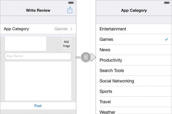
In my previous post, you learned about navigating between different scenes in your app, and learned about using custom user-interface controls in your apps. We started building the Write Review scene (shown on the left side of Figure 1), which we will finish in this post, and we'll move on to the App Category scene shown on the right side of Figure 1. (This post has been updated to iOS 7.1.) 

Completed screens
Figure 1 - The completed Write Review and App Category scenes.

Opening the Project

Follow these steps to open the iAppsReview project (you can also download the project from this link).

  1. Launch Xcode on your Mac, then select iAppsReview in the Recents panel on the right side of the Welcome Window and then click Open. You can also select File > Open Recent > iAppsReview.xcodeproj from the Xcode menu.
  1. After the project is open, go to the Project Navigator on the left side of the Xcode window and select Mainstoryboard.storyboard file to display it in the design surface.

Adding an Image View to the Scene

The first control we will add to the scene is an image view. An image view is used to display a single image or an animation comprised of several images. In this app, we need the image view to display a single thumbnail image of any photo the user selects from their photo album. Let's add the image view now.

  1. Drag an Image View from the Object Browser and position it to the right of the Five Star control button. When the vertical guide line appears on the top and right side of the image view (Figure 2), let go of the mouse button to place the image view on the scene.
Add image view
Figure 2 - Add an Image View to the scene.
  1. Obviously, the Image View is much larger than we want it to be, so let's make it smaller. To do this, grab the bottom-left corner of the image view and drag the corner up and to the right until the size is 40.0 for width and 60.0 for height (Figure 3).
Resize the image view
Figure 3 - Resize the Image View.
  1. An image view's job is to display an image. As it stands right now, when a user creates a new review, there will be no image to be displayed in the image view, so it will be invisible. Eventually, we will allow the user to click on the image view to select an image from their photo library. To indicate to the user that they can click on the image, let's add an image to the image view. In the Attributes Inspector click the down arrow on the right side of the  Image attributes combo box, and select AddImage.png from the list. This displays "Add Image" in the image view as shown in Figure 4.
Set the image view image
Figure 4 - Set the image view's Image attribute.

Adding a Text Field to the Scene

In the Write Review scene shown in Figure 1, the user-interface control shown below the five-star rating control is known as a text field. A text field displays a single line of text that can be edited by the user. In this case, the text field allows the user to enter the name of the app they are rating. Let's add a text field to the scene now.

  1. Drag a Text Field from the Object Browser and position it below the five-star rating control as shown in Figure 5. When the horizontal guide line appears below the five-star control and the vertical guide line appears on the left, release your mouse button to place the text field on the scene.
Add a text field
Figure 5 - Add a text field to the scene.

The horizontal guide line indicates the recommended space between user-interface controls on a scene, and the vertical guide line indicates the recommended spacing of the left edge of a user-interface control to the left edge of the scene.

  1. Now let's extend the text field to the width of the scene (minus the recommended spacing from the edge). To do this, click on the resizing handle (the small white square) on the right side of the text field and drag it to the right edge of the scene until the vertical guide line appears as shown in Figure 6.
Resize text field
Figure 6 - Resize the text field width.
  1. It's a good idea to add placeholder text to a text field to provide the user with a clue as to the kind of information you want them to enter. Placeholder text (as shown on the left side of Figure 7) appears in a text field as a light gray watermark that disappears at run time as soon as the user begins typing in the text field. 

To add placeholder text to the text field, go to the Attributes Inspector and set the Placeholder attribute to App Name.

Set text field placeholder
Figure 7 - Set the text field's Placeholder text.

Your text field is now ready for prime time!

Adding a Text View to the Scene

When the user writes an app review, we want to give them plenty of space in which they can express themselves. We don't want to use a text field because it can only contain a single line of text. In contrast, the text view control allows the user to enter multiple lines of text, including empty lines to create paragraphs. Let's add one beneath the text field.

  1. Scroll down a little further in the Object Browser and drag a Text View directly below the text field until the horizontal and vertical guide lines appear as shown in Figure 8, and then release your mouse button to place it on the scene.
Add a text view
Figure 8 - Add a text view to the scene.
  1. Click on the resizing handle on the right side of the text view and pull its right edge over to the right side of the scene until the vertical guide line appears as shown in Figure 9.
Resize the text view
Figure 9 - Resize the text view's width.
  1. Notice the latin text that appears in the text view control. If you have used tools such as Apple's iBooks Author, you will recognize this as placeholder text that is used to demonstrate the font and color of text that appears in the control. This is different than the placeholder text that you added to the text field. This placeholder text is meant to be deleted, so let's do that.

Go to the Attributes Inspector and click anywhere in the latin text shown in the Text attribute. Press Command+A (hold the Command key down and then press the letter A) to select all the text as shown in Figure 10. Next, press the delete key and then press return to delete all the text.

Select all text view text
Figure 10 - Select all of the text in the text view.

We eventually need to change the height of the text view, but let's add the user-interface controls at the bottom of the scene first, so we can set the height of the text view accordingly.

Adding a Button to the Scene

There is one button that we need to add to the scene — a Post button that posts the user's review to the web. Let's add the button now.

  1. Drag a Button from the Object Library and position it in the bottom left corner of the scene, all the way to the edge of the scene. When the horizontal and vertical guide lines appear as shown in Figure 11, release your mouse button to position the button in the scene.
Add a button to the scene
Figure 11 - Add a Button to the scene.
  1. Now let's resize the button to it fills the full width of the scene. Grag the right side of the button and drag it all the way to the left side of the scene as shown in Figure 12.
Resize the button
Figure 12 - Resize the button.
  1. Next, double-click the button to put it into edit mode, change the text to Post (Figure 13), and then press return
Set Post button text
Figure 13 - Change the button text to Post
  1. Now let's change the background color of the Post button to white. With the Post button still selected, go to the Attributes Inspector and set the Background image property to white.png (Figure 14). If you click anywhere else on the storyboard you will see that the background of the Post button is now white.
Change Post button background
Figure 14 - Set the Background image of the Post button to white.png.

As it stands right now, this button is simply a placeholder and won't do anything at run time when the user taps it. We'll change that in a future post and make it fully functional.

  1. Now that the button at the bottom of the scene is positioned and sized the way we want it, we can change the height of the text view control to take up more of the available space. To do this, first click on the text view to select it, and then click the resizing handle on the bottom of the text view, and drag it downward towards the controls at the bottom of the scene. When the horizontal guide line appears (Figure 15), release your mouse button.
Resize the text view
Figure 15 - Resize the image view.
 

Let's Kick the Tires!
Now you're finished setting up the prototype of the Write Review scene! Lets see how it works at run time.

  1. Click Xcode's Run button, and when the app appears in the Simulator, click the Write a Review row in the main scene.
  1. In the Write Review scene, you can click the buttons and see they are not functional yet. However, if you click in the text field or text view, notice the keyboard pops up from the bottom of the screen as shown in Figure 16. You can click on the keyboard keys to type text into either of the text controls. However, as it stands right now, there's no way to make the keyboard disappear when you're done. We will fix this issue in an upcoming post! For now, you can click the back (iAppsReview) button to return to the main scene, and then navigate back to the Write Review scene to hide the keyboard.
Write Review scene in the Simulator
Figure 16 - The keyboard appears when you click on the text field or text view.
  1. Go back to Xcode and click the Stop button to stop the app from running in the Simulator.

Adding an App Category Scene

I'd like to make some more forward progress on the app in this post, so we'll add one of the easier scenes in the app—the App Category scene. This is the scene that is displayed when the user taps the App Category row in the Write Review scene. It allows them to select a category of app from a predefined list.

  1. Since the App Category scene allows the user to select one item from a list, it makes sense to add a table view controller to the storyboard. To do this, drag a Table View Controller from the Object Library and place it to the right of the Write Review scene as shown in Figure 17.
Add a table view controller
Figure 17 - Add a Table View Controller to the storyboard.
  1. Now let's create a segue between the Write Review scene and the new table view controller scene. To do this, hold the Control key down, click on the App Category cell in the Write Review scene and drag your mouse pointer over to the new Table View Controller scene. When the Table View Controller scene is highlighted in blue as shown in Figure 18, let go of your mouse button.
Create a segue
Figure 18 - Create a segue to the new Table View Controller scene.
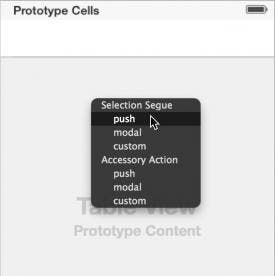
  1. In the segue popup that appears, select the push option as shown in Figure 19.
Select push segue
Figure 19 - Select push in the segue popup.

This adds a segue between the scenes, and adds a navigation bar to the top of the Table View Controller scene (Figure 20).

New segue
Figure 20 - The new segue appears between the scenes.
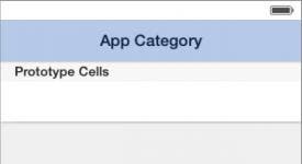
  1. Now let's change the title of the new scene. To do this, double-click in the empty navigation bar at the top of the scene to put it into edit mode. Next, type the text App Category (Figure 21) and then press the return key.
Set the title to App Category
Figure 21 - Set the title to App Category.
  1. Next, let's change the appearance of the table view. First, click in the gray area labeled Table View Prototype Content to select the table view. Next, go to the Attributes Inspector and change the Style to Grouped. This causes the table view to take on the grouped appearance you have now become familiar with (Figure 22).
Set style to grouped
Figure 22 - Set the table view Style to Grouped.
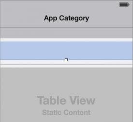
  1. in the prototype version of the app, we want to display a static list of app categories in the table view, so go back to the Attributes Inspector and change the Content to Static Cells. This adds two additional cells to the table view. Since all of the cells in this table view will have the same general appearance, we only need one cell in the table view, so let's delete the last two cells. To do this, click on the second cell in the table view, hold the shift key down, and then click on the third cell to select it too. With both cells selected, press the delete key which leaves one cell remaining (Figure 23).
Delete two cells
Figure 23 - Delete the last two cells in the table view.
  1. For this App Category list, we only need a single label in each cell of the table view. To make this happen, go to the Attributes Inspector and change the Style to Basic. This adds a label with the text Title on the left side of the cell (Figure 24).
Set Style to Basic
Figure 24 - Set the table view's Style to Basic.
  1. We need to add several cells to this table view that each specify a different app category. To do this, with the first cell selected, press Command+D eight times, to create a total of nine table view cells (Figure 25).
Duplicate cell
Figure 25 - Create duplicate cells.
  1. Now we need to change the text of each cell to a different app category. To do this, double-click the left side of the first cell in the table view. This puts the label's text into edit mode. Next, type the text Entertainment, and then press return. Now change the text of all the other cells in the table view as shown in Figure 26.
Set cell text
Figure 26 - Set all the app categories.
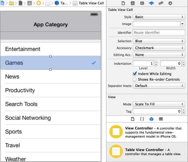
  1. There is one final step we need to perform to finish the prototype version of this scene—add a checkmark to the Games cell. Remember, in the Write Review scene, the App Category cell text indicates the Games category is currently selected (Figure 1). Although the user won't be able to select a different cell in the prototype (they will be able to do that when we complete the app), we need to place a checkmark in the Games cell to reflect the current selection.

To do this, select the Games cell in the table view, and then go to the Attributes Inspector, and change the Accessory to Check Mark. This displays a checkmark on the right side of the cell as shown in Figure 27.

Set the checkmark
Figure 27 - Set the Accessory to Checkmark

Running in the App in the Simulator

Now you're ready to run the app in the Simulator to see how it looks!

  1. Click Xcode's Run button, and when the app appears in the Simulator, click the Write Reviewrow to navigate to the Write Review scene. Afterwards, click the App Category row and you will be taken to the new App Category scene where you can see the check mark in the Gamesrow as shown in Figure 28.
Checkmark in Simulator
Figure 28 - You can see the check mark at run time!
  1. Go back to Xcode and click the Stop button to stop the app from running in the Simulator.

Conclusion

In this post, you were introduced to four new user-interface controls: the text field, text view, image view, and rounded rectangle button. You also reviewed information on how to add a table view controller to a storyboard and configure the table view, including adding a check mark to indicate a selected item. In case you ran into trouble going through these steps,  you can download the completed project from this link.

In my next post, we will finish the prototype app by adding a few new scenes and configuring them to suit our needs. After that, we will learn the basics of writing code so we can turn our prototype app into a fully functioning app!

<<Previous          Next>>

Week in Review: WWDC 2014, Lightning Connected Headphones, and a New Game Controller

$
0
0

Welcome to this week's review of some of the most captivating Apple news stories. It's been a full week with lots of exciting headlines, many of which focused on Apple's impressive Keynote at WWDC 2014. We'll also take a look at some interesting developments concerning new MFi (Made for iPhone) peripheral devices. Let's jump right in!

WWDC 2014: Apple's Most Stunning Keynote in Years

From the surprise presentation of an entirely new coding language for iOS, to the introduction of the incredibly feature-rich OS X Yosemite as well as the spectacular new iOS 8 for iDevices, this year's WWDC Keynote was definitely one to watch. In fact, it's safe to say that this was the most impressive Keynote presentation I've observed in years. As Apple users we certainly have a lot to look forward to over the course of the coming year.

There's been no shortage of excellent internet coverage detailing many of the new OS advancements, much of which has come courtesy of the iPhone Life Magazine team. Both Rheanne Schlee and Jim Karpen provided excellent wrap-ups of WWDC, and Kevin McNeish offered his insightful look at what the new iOS means for developers.

Some of the exciting new features that we can look forward to include: interactive Notifications, improved Spotlight functionality which includes online search, Continuity seamlessly linking all of your Apple devices, awesome new camera editing capabilities, and a new Family Sharing protocol. That's just naming but a few of the hundreds of enhancements on the way this fall for our favorite OS.

I've included this great eight-minute video fro Dom Esposito which takes a quick look at all that awaits us when iOS 8 becomes publicly available in just a few months.

If you are unable to view the embedded video above, just click HERE.


A New iOS MFi Game Controller Fails to Impress

I play a lot of iOS games, both on my iPhone as well as on my iPad. While they are both great for gaming, the iPhone's small screen makes it better for games that aren't as graphically advanced, while the iPad is where the visually stunning games like Real Racing, Modern Combat, and Infinity Blade truly shine. With the exception of relatively simple games like Words with Friends Pro, Super Stickman Golf, Papa Sangre, or Badland, I do the bulk of my gaming on my iPad. So any third-party game controller that doesn't provide the option of effectively connecting to my iPad is limited in usefulness and simply not a very practical investment.

The Razer Junglecat ($99.99) is a nicely designed, customizable (you can remap its buttons and adjust its sensitivity) iPhone-only game controller that shows a lot of thought in every area except for the fact that it doesn't connect to anything but the iPhone. While the Junglecat may have a couple more bells and whistles than some of the other MFi game controllers on the market, and it may be a fine choice for anyone who only plays games on their iPhone, its steep price, limited application, and minimal impact and moisture protection don't exactly inspire me to encourage you to purchase this controller. If you are the kind of person who enjoys playing games on both your iPad and your iPhone, this hybrid controller/case is not for you. Likewise, if you are the type who would like something more than the bare minimum from a "protective" case, again this one isn't for you. But I can't fault anyone for wanting an excellent MFi game controller, in which case I'd point you in the direction of Steel Series' Stratus ($79.99), which is currently my favorite MFi game controller from a company that specializes in high-quality iOS gaming accessories.


Is it a Coincidence? Apple Quietly Introduces New MFi Specifications for Headphones.

 WWDC 2014, Lightning Connected Headphones and a New Game Control

Just days after announcing their purchase of Beats for 3 billion dollars, Apple discreetly introduced specifications that will allow manufactures to bypass the old-style, traditional 3.5mm jack and instead create headphones designed to plug directly into an iDevice's Lightning port. If that sounds pretty amazing to you, that's because it is. The possibilities that this new means of connectivity open up are pretty mind-blowing, and I wont be surprised if Apple uses Beats to promote this next generation of Lightning-connected headphones when they are ready to debut the feature in a consumer product.

As9 to 5 Mac reports, "The Lightning headphones will be capable of receiving lossless stereo 48 kHz digital audio output from Apple devices and sending mono 48 kHz digital audio input. The input means that the headphones will also support a microphone for audio input following Apple’s upcoming update. Manufacturers will be able to take advantage of Apple Headphone Remote controls like Volume Up/Down/etc, as well as other buttons for launching specific apps such as iTunes Radio or initiating playback controls on iOS. In addition, the headphones can be made to work specifically with a companion iOS app and launch a specific app when connected to an iOS device."

 WWDC 2014, Lightning Connected Headphones and a New Game Control

This will change the way people shop for headphones, the new Lightning headphones will be able to do such things as drawing power from your iDevice, powering such digital enhancement features as Noise Cancellation or bass boost, two features that until now required either replaceable or rechargeable batteries within the headphones. Lightning-connected headphones will also potentially be able to provide power to your iDevice, as well as draw power from it. There's even been speculation the Apple will enable headphones to monitor health statistics and incorporate that information in the forthcoming HealthKit.


Fleksy Releases iOS 8 Beta Program for 3rd-Party Keyboard

$
0
0

If you've been hoping for an iOS keyboard alternative, your wait is finally over. At this year's WWDC, system-wide, third-party keyboard support was unveiled for iOS 8.

Third-party keyboard apps like SwiftKey, Fleksy, and Swype will be jumping into the iOS 8 arena immediately. They all expressed interest in the new opportunity and will presumably have their apps ready by fall. 

Apple's own iOS keyboard, called QuickType, will also recieve smarter controls and predictive typing. But support for third-party keyboard apps will offer up new options that were previously reserved for Android users.

Shortly after the announcement was made, Fleksy promptly envisioned what the app will look like once it's released on the new OS. In a tweet, they gave a sneak peek of the layout on iOS 8, along with a link to sign up for beta testing. You can enter your email on the Fleksy beta page to recieve a notification when it's ready to launch. Of course, to test the app you will also need to have access to a pre-release of iOS 8.

Fleksy boasts eyes-free typing, making it popular with visually impaired users. Using "Geometric Intelligence," the app can recognize your typing patterns and autocomplete each word, even if you tap the wrong letters.  

The technology supposedly provides a faster, more accurate typing experience. In fact, the teen who broke the Guinness World Record for fastest typing on a smartphone happened to be using Fleksy.

You can find Fleksy on iTunes already, but functionality is limited. Once system wide keyboard support is available, developers will have unrestricted access to Apple's mobile platforms.

8 Reasons Swift is Easier to Learn & Use than Objective-C

$
0
0

Over the years I have literally taught tens of thousands of people how to write code in Objective-C through training classes, conferences, online forums, and my book series. Based on the mountain of feedback I have received, I can tell you some key points that make Swift much easier to learn than Objective-C.

If Objective-C is the only language you have ever coded in, I have one thing to say about moving to Swift. Welcome to the 21st century.

I have coded for many years in other more modern languages such as Java and C#, so when I added Objective-C to my repertoire in 2008, there were a lot of things I missed from the other languages I work in. Fortunately, I'm getting most of that back with Swift.

1. Classes are Defined in a Single File

In Objective-C, classes are defined in two files—a header (.h) file and an implementation (.m) file. This is a real pain in the neck, and one of the biggest complaints I hear from developers moving to Objective-C. 

In Swift, your classes are defined in a single .swift file. Thank you Apple.

2. No More Square Brackets for Messages

The square brackets used to pass messages to an object are the second biggest complaint I have received about Objective-C. It's unlike other more modern languages and it really throws a curve to people new to Objective-C.

In Swift, you use dot notation to call a method on an object, similar to the notation you use when accessing a property. For example:

addToTotal

This code calls the calculator object's addToTotal method, passing 14 as the value to be added.

3. The End of the Asterisk

I can't tell you how many times I have had to answer the question of why some variables in Objective-C have asterisks associated with them and others don't (variables that hold a pointer to an object have an asterisk). 

In Swift, a variable can contain a pointer to an address in memory (although not a direct pointer), but you don't ever need to use an asterisk in this context. I'm weeping openly. 

4. No More Messages to Null Objects

In Objective-C you can declare a variable that is designed to hold a reference to an object. However, if you forget to create an instance of an object and store it in this variable, there was no compiler or run-time error generated because Objective-C allows you to send messages to null objects. For example:

memoryClear

I've heard all the arguments about why this feature of Objective-C is great, but from a practical perspective, for the majority of the code that you write, this is a bad thing because when you do this unwittingly, it causes something to not work properly in your app and you don't know why.

Enter Swift. 

Swift doesn't allow you to create properties or variables that are not initialized. If you forget to initialize a variable you will get a compiler error and you will know immediately what you did wrong rather than spending several minutes stepping through the debugger.

The more errors that are caught at compile time, the easier your app development will be. Period.

5. Importing Just Got Easier

Importing header files in Objective-C is cumbersome. If you want to work with a class from within another class file you have to import its header file first. 

In Swift, all classes you created in a single project can automatically be accessed without using an import statement.

6. Alloc and Init are No More!

In Objective-C you create an object from a class like this:

alloc init

In Swift, you create an object from a class like this:

swift instantiate

Much easier! I'm going to plan an extra day of vacation this summer for the extra time I'll be saving by not typing alloc and init.

8. No More Rockets Blowing Up!

A number of years ago, one of the space agencies was launching a rocket that self-destructed not long after takeoff. They discovered that the problem was caused by a programmer who left a break out of a switch statement. Ouch.

In Objective-C, if you accidentally leave out a break in a switch statement, control automatically flows down to the next case in the switch. This is rarely desired behavior and can wreak havoc in your app.

In Swift, you don't need to add a break statement to each case in a switch because after a case executes, the switch is automatically exited. What's also nice about Swift switch statements is that you can test for just about anything including strings! Here is an example from Apple's documentation:

switch

No break statements, hence no bugs caused by leaving them out!

8. Easier String Manipulation

In Swift, working with strings is much easier and far more obvious to programmers new to the language:

  • Strings don't need an @ in front of them as they do in Objective-C.
  • You can combine strings together by using the + operator.
  • You can check if two strings contain the same characters by using the = operator

These behaviors are all expected and make string manipulation and comparison far easier.

Conclusion

This list is really just a small subset of the more obvious things to love about Swift. In future posts I'll go into more detail and show you the basic syntax and mechanics of Swift.


Rumors: iWatch to Arrive in October, Will Have Curved LED Display

$
0
0

The blogosphere was buzzing with rumors about the so-called iWatch on Friday, with a news report on Nikkei Asian Review saying Apple was planning to come out with a wearable device and a report on Re/Code saying Apple's tentative launch date for the device will be October. In addition, the Nikkei report, citing industry sources, also said that Apple is confident in the market for the device and is planning to manufacture 3–5 million units per month. The design is currently being finalized and it will likely have a curved LED display. Plus, it's expected to have a focus on health, and will be able to track things such as calorie consumption, sleep activity, blood glucose, and blood oxygen levels.

The article says the Apple device is expected to communicate with one's iPhone, such that, for example, incoming alerts and text messages will appear on the display, much like other smart wearables such as the Pebble watch.

Given Apple's launch of HealthKit and the Health app, the arrival of an iWatch or other wearable isn't too surprising, especially given Apple's partnership with Nike, and Nike's recent decision to stop developing the popular Nike FuelBand.The Nikkei article doesn't actually use the term "iWatch", which was created by the rumor mill, and it will be interesting to see how Apple positions the device. CEO Tim Cook has pointed out that young people don't wear watches, yet he's also explicitly said that Apple is interested in wearables. Plus, he's known to be a fan (and user) of the FuelBand.

What would the device look like? I'm betting it will look more like a band than a watch, such as the rendering accompanying this post that comes from AppleInsider. My sense is that a band would be more stylish. And if the face is long and narrow, then it would almost necessitate its being curved, as the rumor suggests.

The Nikkei article points out that health-monitoring devices and services have been around for a while but haven't really taken off. This could be yet another instance in which Apple jumps into a market that already exists and transforms it by making a device that is more intuitive and that people love. There were many brands of MP3 players before the iPod, but once Apple jumped in, the market exploded. And most of the other brands disappeared in Apple's wake.

Apple News: What's Next After WWDC

$
0
0

Apple's Worldwide Developers Conference has come and gone. While there were plenty of surprises, like a whole new programming language called Swift, new hardware was conspicuously absent. Indeed Apple's hardware chief, Phil Schiller didn't even take the stage at the WWDC Keynote. However, Eddy Cue has been on the record days before WWDC saying "Later this year, we've got the best product pipeline that I've seen in my 25 years at Apple." All of this points to a flood of hardware releases in time for the Holidays. So what can we expect?

A new iPhone (or two) is a given. Photos of cases are already leaking out and they seem to be consistent. A larger iPhone is overdue, to compete with the "phablet" (phone + tablet) phenomenon popular by Android devices. The rumor mill suggests a 4.7-inch display, and perhaps a second new iPhone with a 5.5-inch display.

September has been the consistent release date, and more than any other product, it makes sense to have a consistent release date for phones. Early adopters are likely to be on a two year contract and those contracts should be up in September, giving Apple an instant market. September is also Back-to-School time, and customers will take advantage of Apple's typical Back-To-School promotions like free iTunes and App Store gift cards with purchase of an iPhone, iPad, or Mac.

Education has always been a priority for Apple, and Macs are great for school. I bought my first Mac in 1984, the day I arrived on campus at Carnegie-Mellon University. I also applied for a job at the CMU Computer Store. I got the job, and became Apple's Student Representative and worked there all four years selling Macs. So I know how popular a new Mac can be to an incoming student! Students and teachers would welcome a refresh to the Mac product line just in time for the new school year. There have been rumors of a 12-inch MacBook Air to replace the 11-inch and 13-inch models. This would help consolidate the product line and offer better differentiation with the 13-inch MacBook Pro with Retina display.

The iPad Air and iPad mini with Retina Display will be a year old soon. Many observers expected Touch ID support a year ago, so this year, that seems like a given, especially with iOS 8 offering deeper integration of Touch ID.

As iPhones get bigger, I'm becoming more interested in an iWatch. My iPhone is often in my pocket or on a charger, and thanks to my Pebble watch, or Martian Watch, I can get Caller ID and text messages on my wrist. The Pebble lets me reject or answer a call, but I still need to find my phone to talk. The Martian Watch acts as a Bluetooth speakerphone, so I can talk with the caller via my watch! It's great, especially when I'm on my motorcycle. I still pull over, but I don't need touchscreen compatible motorcycle gloves (though I have some.) With an even bigger iPhone, I would expect to use a smartwatch even more to receive calls. And soon, with Mac OS Yosemite and iOS 8, we can place and receive iPhone calls using a Mac!

Beats team

Finally, the Apple TV is always due for an update, but it might take some time for the recently acquired Jimmy Iovine to work his magic on the cable and entertainment companies, the way Steve Jobs did with record labels!

Dr. Dre's "Cool" and Perfectionism May be the Perfect Complements to Apple

$
0
0

The Wall Street Journal recently ran a very positive feature on Dr. Dre (aka: Andre Young) suggesting that his work ethic and demanding perfectionism are more similar to Steve Jobs than one might have ever imagined. While Dre declined to comment or be interviewed for the WSJ article, through interviews with some of his friends and associates, the article paints a picture of a visionary artist and a culturally astute businessman who shares a lot in common with Apple's original visionary influence, the late Steve Jobs.

" class="wysiwyg-break drupal-content" src="/sites/all/modules/wysiwyg/plugins/break/images/spacer.gif" title="<--break-->"> 

As the Wall Street Journal's Hannah Karp reports, "Dr. Dre's process is mysterious, colleagues say: His assessments are usually immediate, personal and articulated sparely. He often dismisses ideas such as posing for clichéd photos in a recording studio as too 'corny' or 'cheesy.' Or he'll wave them off with a terse 'I'm not feeling that.' 

"Dr. Dre's laconic style highlights his keen awareness of a universal dilemma, said Mr. Iovine: 'Once you try to describe cool you run the risk of going perpetually to non-cool hell. The whole premise is not to talk about it.'

"Dr. Dre's perfectionist impulse, coupled with his disregard for artificial deadlines, have meant that 'he doesn't put out a lot of material,' despite being a workaholic, said Paul Rosenberg, a lawyer and manager of one of Dr. Dre's protégés, rapper Eminem."

In addition to the Journal's praise for Dre's Jobsian intuition and perfectionist drive, a recent study in which 10,000 students were polled indicates that Apples acquisition of Beats, Dr. Dre and his team, has already raised Apple's cool factor significantly among the younger generation of consumers, many of whom consider Dre to be stoically cool and his headphones a status symbol. In fact Dre inspires loyalty not only in teens and twenty something's with his line of headphones and the top hip hop performers he produces, but also in the many people in their 30s and 40s grew up with Dre's music and more importantly, his cultural influence. Dre joining forces with Apple will potentially provide Apple with a huge new consumer demographic, a demographic that already feels a sense of loyalty and even perhaps, vicarious jubilation that this kid from deep in the ghetto, the founding father of gangsta rap, is now offering his skills and business savvy to a company that may have, until now, been perceived by some of the younger generation, as being squeaky clean and a little too predictable.

Dre has never been one to stress the typical pressures that influence and direct the decision making of so many musical artists and producers or large corporations. In fact, despite the fact that his only two solo albums, (The Chronic and The Chronic 2001) sold millions, Dre has not released an official follow up to those hits, choosing instead to focus on producing such superstars as Eminem, Jay-Z, and 50 Cent.

Dr. Dre's

Dre's insistence on quality control, right down to the font style (sound familiar?) leads me to believe that he will be a perfect fit at the notoriously detail-oriented company that Apple is. One never knows what the future holds, that's for sure, but it seems to me that with all Dre brings to the equation; from Beats Music and Jimmy Iovine, to his enigmatic cool-factor, that Dre's future with Apple will be a bright one indeed.

Tip of the Day: How to Set Special Ringtones for Individual Contacts

$
0
0

If you want to know which friend or family member is calling you without having to look at your iPhone screen, you can assign them each their own ring tone.

In Phone open Contacts and select the person you want to assign a special ringtone to. Then scroll down and tap Ringtone. Choose the ringtone you want and then tap Done. That ringtone will now play whenever that contact calls you. You can also use this method to change the text tone and vibration patterns.


Once you have selected a ringtone or text tone, you will be able to change them directly from the contact card without tapping Edit.


Top image credit: Johan Larson/Shutterstock.com

Unleash Your Inner App Developer Part 6: Finishing the Prototype

$
0
0

Haleakala sun

Do you have an idea for an app, but lack the programming knowledge to begin building it? In this weekly blog series, How To Unleash Your Inner App Developer, I will take you, the non-programmer, step by step through the process of creating apps for the iPhone, iPod Touch, and iPad. Join me each week on this adventure, and you will experience how fun turning your ideas into reality can be! This is Part 6 of the series. If you're just getting started now, check out the beginning of the series here (this post has been updated to iOS 7.1.)

In my previous post, you were introduced to several user-interface controls including the text field, text view, image view, and rounded rectangle button. We finished the main iAppsReview scene and added a new App Category scene.

Taking Off the Training Wheels

Now that you have learned some of the basic skills for adding new scenes to a storyboard and configuring table views, I'm going to have you create a few scenes on your own. I find that once you take off the training wheels (the explicit step-by-step instructions with images for each step), you really find out what you know, and what you don't know. All of the instructions for creating the scenes in this post can be seen in the video I have create for this post which can be found at this link.

To begin with, launch Xcode and open the iAppsReview project you have created so far, or you can download the project from this link.

Creating the My Reviews Scene

As shown on the right side of Figure 1, the first scene you are going to create is the My Reviews scene. In this scene, the user can read the reviews they have written for different apps. This scene is triggered from the Read Your Reviews row of the iAppsReview scene.

The My Reviews scene
Figure 1 - The My Reviews scene is triggered from the Read Your Reviews row.

You have already learned everything you need to know to create the My Reviews scene. The main steps to follow are outlined below. Afterwards, you can watch Part A of the video I have created for this post:

  1. Add a new Table View Controller to the storyboard. Although Figure 1 shows the scene directly to the right of the iAppsReview scene for the sake of clarity, I recommend positioning it directly below the Write Review scene instead;
  1. Create a push segue between the Read Your Reviews row of the iAppsReview scene and the new table view controller;
  1. In the navigation bar of the new scene, change the title to My Reviews;
  1. Change the table view's Content attribute to Static Cells;
  1. Change the table view's Style attribute to Grouped;
  1. Delete the last two cells in the table view;
  1. Change the remaining cell's Style attribute to Basic;
  1. Set the cell's Accessory attribute to Disclosure Indicator;
  1. Make four duplicates of the cell;
  1. Change the Text of the cell's label from Title to Doodle Jump;
  1. Change the Text of the other cells' labels to the text shown in Figure 1;
  1. Run the App in the Simulator to see how it looks at run time!

Creating the Online Reviews Scene

Next, you are going to create the Online Reviews scene shown on the right side of Figure 2. This scene allows users to read online reviews that other users have written. This scene is triggered from the Read Online Reviews row in the iAppsReview scene.

The Online Reviews scene
Figure 2 - The Online Reviews scene is triggered from the Read Online Reviews row.

This scene is very similar to the My Reviews scene you created in the previous section, except the table view has two sections instead of one. The cell in the first section of the table view has its Style attribute set to Right Detail. The cells in the second section of the table view have their Style attribute set to Basic. For the sake of organization, I recommend you locate this new scene on the storyboard directly below the My Reviews scene you created in the previous section.

See if you can create this new scene by yourself. You can refer to the steps in the previous section and in previous posts for clues, but try to create it on your own. Afterwards, you can watch Part B of the video I have created for this post.

Creating the Review Scene

Both the My Reviews and Online Reviews scenes can share a Review scene where the user can read their own reviews as well as reviews posted by others on line. Figure 3 shows what the final scene should look like. This scene can be launched from the Doodle Jump row in the My Reviews scene as well as the Doodle Jump row in the Online Reviews scene.

Review Scene
Figure 3 - The Review scene

Again, you should be able to create this scene from the information I've given you in my previous posts. Afterwards, you can watch Part C of the video I have created for this post. 

Here is a list of the main steps:

  1. Add a View Controller to the storyboard and position it to the right of the My Reviews scene;
  1. Create a push segue from the Doodle Jump row of the My Reviews scene to the new view controller;
  1. Create a second push segue, this time from the Doodle Jump row of the Online Reviews scene to the new view controller;
  1. Change the title of the navigation bar in the new view controller to Review;
  1. Set the Background color attribute to the light gray crayon color named Mercury;
  1. Add a Label to the top center of the scene (positioned according to the guide lines). This label is used to display the name of the App being reviewed. Change the Font attribute of the label to System Bold 17.0. Set the Alignment of the label to Centered, and then stretch the left and right sides of the label to the width of the scene until you see the left and right guide lines appear. Finally, change the text of the label to Doodle Jump;
  1. Add a second Label directly below the label you just added. This label is used to display the app category. Set the label's Alignment to Centered and then stretch the label to the left and right edges of the scene using the guide lines. Finally, change the text of the label to Entertainment;
  1. Now you're ready to add the five-star review control to the scene. To do this, add a View to the scene directly below the label you just added, and place its left edge on the scene's left guide line. Go to the Size Inspector and change the view's Width to 175 and the Height to 60. Finally, go to the Identity Inspector and change the Class to mmStarRating;
  1. Add an Image View directly below the label, but on the right side of the scene. The image view is used to display a thumbnail of an image that may be associated with the review. Go to the Size Inspector and change the image view's Width to 40 and its Height to 60. Afterwards, reposition the image view to the right side of the scene. Finally, go the Attributes Inspector and set the Image to AddImage.png;
  1. Add a Text View control directly below the five-star review control. The text view will be used to display the review comments. Next, center the text view in the scene and then stretch the left and right sides of the text view to the edges of the scene using the guide lines. Delete the latin text from the text view and replace it with the text shown in Figure 3 (or text of your own choosing);
  1. As your final step in this scene, pull the bottom of the text view control down towards the image view until you see the horizontal guide line appear;
  1. Run the App in the Simulator to see how the new scene looks at run time!

Creating the Settings Scene

The next scene that needs to be created is the Settings scene shown in Figure 4. This scene allows the user to log in using their email and password, or, if they don't have an account yet, sign up for one. Later in this blog series, we will enhance this scene so the user can enter their email address and password directly into the table view rows. 

Settings scene
Figure 4 - The Settings scene.

Go ahead and try this on your own using the steps outlined below, and then afterwards, you can watch Part D of the video I have created for this post. 

  1. Add a Table View Controller to the storyboard and place it below the Online Reviews scene;
  1. Create a push segue from the Settings & Feedback row of the iAppsReview scene to the new table view controller;
  1. Change the title in the navigation bar of the new scene to Settings;
  1. Change the table view's Content attribute to Static Cells, and its Style attribute to Grouped;
  1. Delete the last two cells in the table view, leaving one cell remaining;
  1. Change the remaining cell's Style attribute to Basic;
  1. Change the Color attribute to the crayon labeled Tin;
  1. Since we need two cells in this table view, click off the cell label and then click back on it again to select the cell itself. Afterwards, press Command+D to create a duplicate of the cell;
  1. Change the text of the first cell's label to Email Address and the second cell's label to Password;
  1. Now let's set the header text of the table view. To do this, click in the gray area right next to the table view to select the table view section, and then change the Header attribute to Log in using email and password;
  1. Now we need to add a view directly below the table view to contain the other controls in the scene. To do this, add a View to the scene and position it below the table view until you see the blue horizontal bar appear and then release your mouse to place the view on the scene. Next, drag the resizing handle on the bottom of the view until the height of the view is 264 pixels;
  1. Change the Background color attribute of the view to the Mercury crayon color;
  1. Add a Button at the very top-center of the view you just added. You can place it right against the top edge of the view. Change the title of the button to Log in. Stretch the left and right sides of the button to the left and right edges of the scene. Afterwards, set the Background image attribute of the button to white.png;
  1. Add a Label centered directly below the button you just added, using the horizontal guide line for spacing. Set the Alignment attribute of the label to Centered and then stretch the left and right edges of the label up to the vertical guide lines in the scene. Afterwards, change the Font of the label to System 14.0. Finally, change the Text of the label to Don't have an account yet? Sign up!
  1. Add a Button centered directly below the label you just added. Change the text of the label to Sign up. Afterwards, stretch the left and right sides of the button to the left and right vertical guide lines of the scene, and then set the Background to white.png;
  1. Add one final Button to the bottom center of the scene. Change the Text of the label to Provide Feedback. Afterwards, stretch the left and right sides of the button to the left and right vertical guide lines of the scene, and then set the Background to white.png;
  1. Run the App in the Simulator to see how the scene looks at run time!

Conclusion

There's one more scene left to be created—the Feedback scene that allows the user to provide feedback about the app. This scene provides some special challenges that require us to write a small amount of code, so we will cover that in my next post.

Hopefully, you were able to perform most of the steps on your own. In case you ran into trouble going through these steps, you can download the completed project from this link. If you had to rely on the videos to complete each scene, I recommend going back through and trying it again until you can complete the steps on your own. Doing this will provide you with a solid basis for creating prototypes of your own iOS apps!

<<Previous          Next>>


Big Changes for Photo Storage and Editing in iOS 8

$
0
0

Apple's Photos app and the approach to storage are among the biggest changes you can look forward to in iOS 8. The new iCloud Photo Library gives you the option of replacing the confusing Photo Stream, which is limited to your most recent 1,000 photos. All your photos and videos will now automatically live in the cloud if you enable this feature. Photo Stream is free, but with iCloud Photo Library you'll need to pay for this storage if you exceed the 5GB of free space. iCloud storage, though, will now be much cheaper, at just $0.99 per month for an additional 20GB and $3.99 per month for an additional 200GB.
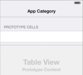
As Macworld says, Apple's current approach to photos is "messy," with Photo Stream, Cameral Roll, and your synced photo Library together making it more complicated than need be. iCloud Photo Library reconceptualizes your photo storage and makes it simpler. Your original photos, no matter the size, live in the cloud. As with iOS 7, they are automatically organized into Moments, Collections, and Years. You can create albums, mark favorites (by tapping the small heart under each photo), and reorganize your photos. Any change you make to organization is reflected on all your devices. A great feature of iCloud Photo Library is that it can automatically store original images in the cloud and leave a version on your device that's a smaller file size suited to the screen of your device—thereby saving space on your iPhone or iPad.

In addition to making it easy to store and organize your photos, Apple's new approach to photos adds powerful and smart search capabilities. When you do a search, the search field prompts you by showing a collection of photos taken nearby, a collection from a year ago, and your favorites. You can also search by date, time, location, and album name. Plus, in the Albums view you can sort your photos in a variety of ways, such as according to the app used to edit them and according to the type of file (photo, video, panorama, time-lapse video, etc.).

The new Photos app will have more powerful editing capabilities. Any edit you make will automatically be registered across devices. But if you mess up, you can always go back to the original version. The Photos app lets you crop photos and, in an interesting twist, can even automatically straighten the horizon for you if the photo is a bit skewed. The app makes it very easy to adjust lighting and color just by moving a slider. You can fine tune facets such as brightness, contrast, exposure, highlights, shadows, and vibrancy. And you can rotate photos and control aspect ratio. The Photos app includes filters and the opportunity for third-party developers to create additional filters.

Finally, a cool new feature in iOS 8 is the ability of the Camera app to shoot time-lapse videos using an interval that you specify.

All of this is pretty exciting, and took everyone by surprise. 

It's Time for Writers to Embrace Creating With the iPhone

$
0
0

As an aspiring novelist, I'm always curious to see what tools other writers are using to work on their manuscripts. In his introduction to On Writing Well, William Zinsser partly lamented the rise of technology, because it made it far too easy for bad writers to publish their work.  On the other hand, he liked that technology also made it easier for good writers to publish their work.

But he was only speaking about computers. What effect does technology have on writers now that smartphones are so commonplace?

I personally like the fact that I can write on my iPhone whenever I want. Much like some people are always texting, I'm always writing. I can use the Google Drive app to work on my my novel at a continuous pace, basically without any interruption (well, except for when the connection goes bad...)

Sometimes I'll compare my experiences with my other writer friends, and I find that they don't always agree with me. They all have iPhones, but they still prefer writing their stories out in longhand, because they think it's more natural that way. If worse comes to worse, they'll transcribe everything onto their computers, but will still avoid writing on their phones.

Meanwhile, I'm so spoiled by technology that I'll actually take a break from writing on my computer in order to lie in bed and write on my iPhone. I don't understand why anyone would still want to write using a pen and paper, when there's such an abundance of flashing screens that will make their work look way prettier than the scribbles on their paper ever will. And besides, wouldn't you prefer to delete the bad chapters in virtual space, so you can avoid wasting paper? Personally, I think a good writer should also be environmentally conscious.


Top image credit: Marta Paniti/Shutterstock.com

Notification Center in iOS 8 Will Be Customizable, Including Widgets

$
0
0

Notification Center, which was introduced in iOS 5 and expanded in iOS 7 with several tabbed views (Today, All, and Missed), will now be greatly enhanced in iOS 8, with new customization features including the ability to add third-party widgets to the Today view. In the current beta, the default in the Today view is Today, Traffic Conditions, Calendar, Reminders, Stocks, and Tomorrow Summary. A new Edit button lets you somewhat rearrange this list and also hide items. Developers of apps can now also develop widgets associated with their apps that you can choose to display on your Today screen. You'll be able to add widgets such as weather, sports scores, and current eBay auctions. 

In addition, iOS 8 lets you respond to many different kinds of notifications from the lock screen or from within apps, without having to go to the related app. This was a much-requested feature for Messages. Now it's not only possible to respond to text messages without going to the app, you can also accept or decline calendar invitations, mark an email as read or delete it, and mark a reminder as complete. In addition, third-party developers will now also be able to include interactive notifications in their apps, such that this feature won't just be available on Apple's apps. 

Interactive notifications are a real convenience, letting you reply quickly and then get back to whatever you were doing.

Swift 101 - Classes, Variables, Properties & Methods

$
0
0

As promised, here is my first installment on learning to program in the new Swift language!

Defining Classes in Swift

The following code shows an example of a Swift class definition:

Declare a class

To declare a class in Swift, you use the class keyword followed by the name of the class. If it has a superclass, you add a colon and the name of the superclass. The beginning and end of the class are indicated by the opening and closing curly braces.

In Swift, classes are defined in a single .swift source code file as compared to Objective-C, where classes are defined in two separate files, a header (.h) file and an implementation (.m) file.

Declaring Variables

The following code shows an example of a variable declaration:

Declare a variable

You begin a variable declaration with the var keyword followed by the name of the variable. Next, you add a colon, followed by the variable type. Afterward, you can assign a value to the variable using the (=) assignment operator.

In Swift, if you assign an initial value to a variable, you don't need to specify the variable type as shown in the following code:

Declare variable, no type

You can do this because Swift has something called type inference where it can figure out, or infer the type of the variable based on the value you assign to it. 

In Objective-C you can declare instance variables at the class level and local variables within methods. In Swift, there are no class-level variables—only local variables that you declare within methods. However, you can declare properties at the class level (see the Declaring Properties section below.)

The End of the Asterisk

In Objective-C you use an asterisk to indicate that a variable holds a pointer to an object. In Swift, a constant or variable can contain a pointer to an address in memory (although not a direct pointer), but you don't ever need to use an asterisk in this context.

Declaring Simple Properties

The following code shows an example of a property declaration:

Property declaration

As you can see, it's very similar to declaring a variable, except that you declare a property at the class level rather than within a method.

As with variables, if you assign an initial value to a property, you don't have to specify the property's type. You can also initialize properties from within initializer methods (see the section below on Initializers for details.) The following code shows an example of declaring a property without specifying a type:

Property declaration no type

In Objective-C, properties typically had backing instance variables in which the actual value of the property was stored. Swift simplifies properties by unifying the concepts of properties and instance variables. Properties no longer have a backing instance variable. Everything about a property is declared in a single location.

In Swift, you don't have to use the self keyword to refer to a property unless the method in which you are writing code has a parameter with the same name as the property.

Declaring Computed Properties

Swift also has computed properties that have associated get and set methods as shown in the following code:

Calculated property

In this example, the Thermometer class has a simpletemperatureFahrenheit property and a computedtemperateCelsius property.

Notice that the get and set methods of the Thermometer class do not reference an instance variable, because there is no such thing as an instance variable in Swift!

In this case, the get method retrieves the value from the temperatureFahrenheit property, converts it to Celsius and returns the value. The set method takes the value passed to it, converts it to Fahrenheit and then stores the result in the temperatureFahrenheit property.

The value passed to the property's set method is stored in an implicitly named parameter called newValue. If you want to use a different parameter name, you can specify the name in parentheses after the set as shown in the following code:

Named setter parameter

Specifying a parameter name can make your code easier to understand. In this example, setting the name of the parameter to celsiusValue makes it clearer that the set method is converting the value from Celsius to Fahrenheit.

Declaring Methods

The following code contains an example of a Swift method declaration:

Method declaration

As with Objective-C, in Swift, you declare an instance method between the opening and closing curly braces of the class to which it belongs.

To declare a method, you first specify the func keyword, followed by the name of the method. If the method has parameters, you include them in the parentheses. For each parameter, you specify the name of the parameter followed by a colon, followed by its type. If the method has a return value, you then add a hyphen and greater than sign (->) followed by the type of the return value.

The following code contains an example of a method that accepts no parameters and returns nothing:

A method with no parameters or return value

As you can see, parentheses are required after the method name even if there are no parameters. A method that returns nothing doesn't need the return value indicator (->) after the parentheses.

Initializer Methods

The following code contains an example of an initializer method that is used to initialize a class.

Initializer method

Initializer methods are always named init and, unlike Objective-C, never return a value. In the above example, the init method accepts a currentTemperature parameter in which you can pass the initial temperature. This value is then stored in the temperatureFahrenheit property.

You can create multiple initalizer methods as shown in the following code sample:

Multiple initializers

In this example, both methods are named init, so to make the names unique, an external name is assigned to the parameters—fromFahrenheit and fromCelsius. This makes the full method names init(fromFahrenheit:) and init(fromCelsius:) respectively.

It's worth noting that in Swift, init methods are not inherited. From a practical perspective, this means you shouldn't place any code in an init method that you want to be able to override in a subclass. If you have code that you want executed during the init phase of a class and want to be able to override that code in a subclass, you can create a separate method, place the initialization code in that method, and then call that method from the init.

Creating an Instance of a Class

Here is an example of how to create an instance of a class:

Create an instance

As you can see, to create an instance of a class, you declare a variable to hold a reference to the class, type an equal sign (the assignment operator) and then the name of the class followed by parentheses.

Conclusion

These are some of the very basics you need to know to get started with Swift programming. In upcoming posts I will dive deeper into the language to help you become proficient with Swift's new syntax and structure.
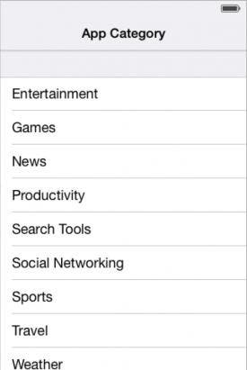
Tip of the Day: Flick Away Unwanted Notifications

$
0
0

This was billed at WWDC as a part of a new suite of features for iOS 8, but in fact you can already flick away notifications in iOS 7 that are intruding on your activities.

Getting an unwanted notification when you are in the middle of a task can be incredibly annoying. My NBC News app has recently received the top spot for unwanted random messages, but I am sure something else will dethrone them soon enough. Instead of waiting for the intolerable notification to take its sweet time and disappear on its own you can impatiently flick the notification upward, feel a sense of vindictive satisfaction, and get back to your game of Angry Birds Star Wars.

angrybirds notification in ios7 screenshot

I find this feature most useful when I am in the middle of a task like navigating through Photos or Mail where my standard top left navigation options are obstructed by someone else's agenda. Arrrggh.

mail notification in ios7 screenshot tab


Top image credit: Loskutnikov/Shutterstock.com

Viewing all 13234 articles
Browse latest View live